Soho, London
Tuesday, 31 March 2009
Sunday, 29 March 2009
BERNIE FUCHS
In 1958, a staff artist worked patiently in a back room at the famed Cooper Studio in New York, retouching the Pepsi Cola logo on a stack of illustrations. He came to an illustration by a new, unknown artist and stopped dead in his tracks.
Illustrator Murray Tinkelman, who also worked at Coopers, remembers receiving the call: "Hey Murray, come take a look at this." Tinkelman went over to see the new picture. "It was gorgeous" he recalls. The two decided to call in the superstars of Cooper Studios, Joe Bowler and Coby Whitmore. Bowler and Whitmore arrived together to inspect the new painting. Whitmore was "speechless." Bowler said, "I don't know who the hell did this, but the business is never going to be the same."
Bowler was right.
Young Bernie Fuchs arrived in New York and quickly set the field on fire. By the time he was 30, the Artists Guild of New York had voted him "Artist of the Year"-- an unprecedented achievement. His dynamic illustrations for magazines such as McCalls made him famous and attracted dozens of imitators.
So Fuchs was feeling pretty cocky by the time Sports Illustrated called him in the early 1960s to ask him to illustrate an article. Fuchs met with the legendary art director of Sports Illustrated, Richard Gangel. A tough minded visionary, Gangel gave Fuchs an assignment, but as Fuchs was leaving, added-- "Oh-- and I don't want that shit you do for McCalls."
Fuchs could have walked off in a huff. It would have been easy for him to continue working for other clients in the successful style he had already developed. Instead, he rose to Gangel's challenge and became even bolder and more innovative:
Image courtesy of Illustration House gallery
For a later issue of Sports Illustrated, Fuchs turned a portrait of the rather dumpy looking Branch Rickey into poetry.
Fuchs left behind all the imitators who continued to exploit the formula for Fuchs' earlier approach, and instead moved forward to grapple with new challenges. As illustration styles came and went, Fuchs' work was selected each and every year for more than 40 years by different juries from the Society of Illustrators as among the very best work produced that year. No other illustrator can claim such a record.
I am convinced that in order to accomplish what Fuchs has, you need both of the qualities demonstrated in the two stories above. You have to begin with great talent, sure, but perhaps even more important, you have to be prepared to take your initial success and re-invest it in new challenges. There is no guarantee that such a gamble will pay off, but if you are really, really good, that's what artistic success is for.
Saturday, 28 March 2009
Friday, 27 March 2009
Wednesday, 25 March 2009
From Sketch To Vector Art
Vector Art Blog is always watching. And we never miss the chance to spread the word about online publications that we love."Locus Of Control" Blog just posted a great digital illustration tutorial that explains the process of creating sharp vector artwork from a sketch using a scanner and the Live Trace feature in Illustrator...
"When you scan a sketch into your computer, the lines are often light and have fuzzy edges. Resizing the scan blurs or pixelates the image. You can use Photoshop to darken the lines, but they’re still not going to be as clean and sharp as if you vectored the sketch.Vectoring your scanned sketches is great for comics or other artwork, and is especially handy in the process of logo design." Full Tutorial
Damask Flower Pattern for Adobe Illustrator
A free seampless pattern in Damask style from Grunii. The pattern is fully customiable with Adobe Illustrator.
You can find great damask color schemes using the search engine under the palettes section at Colourlovers.com...
To use, first you have to expand the ZIP archive. Download
You can find great damask color schemes using the search engine under the palettes section at Colourlovers.com...
To use, first you have to expand the ZIP archive. Download
Jenny Holzer - The Meaning of Everything
There once was a man who wanted to discover the meaning of everything.
He wandered across the world, searching for someone wise enough to explain to him what all this was about, what was the meaning of everything.
After many years, in a distant land, he was told there is one Sage who knows the secret, the meaning of everything.
So he traveled to the huge house where the old Sage lived. He knocked at the door, but there was no answer. He tried opening the large wooden door. It was not locked. The traveler entered the house, to find himself in an enormous hall with walls covered in shelves with books. He walked further in and entered a large room also filled with books. He moved to the adjacent room - and discovered that there, too, shelves were everywhere, and on them - only books. He approached one of the shelves and picked up a random volume. He opened it, and inside it, he saw the letter N, filling the pages. The pages of the book were all but rows of NNNNNN...
He picked up another book, opened it - the book was filled with TTTTTTT.... He tried another one, and another, and each of them was filled with but one letter.
Flabbergasted, the traveler wanted to sit down, when the Sage came in. He was an old, grey-bearded man, just as the fairy-tales have it.
"Sir, said the traveler, I don't understand, there is... I don't understand!"
The Sage smiled, and replied, "Now all you need to do is connect the letters."
Although text is at the heart of her work, Jenny Holzer is not really a writer. She is rather a reader. Her work is not so much about text, as it is about giving body to text. But, as the authorship becomes blundered (Holzer signs the work, but none of the texts that compose it), writing is always re-writing, and thus, it is fundamentally about the embodyment reading.
Somewhat following the path suggested by the likes of Barthes, Baudrillard or Foucault, Holzer is a semiotic DJ, reconfiguring and re-shaping the meaning that seems to have been there long ago. If her own words appear in the works, they seem to remain transparent, undistinguishable from external sources. (Remember the famous line, "Protect Me From What I Want"? Can you say if it was Holzer's own sentence, or an appropriation of someone else's?).
In one of her recent projects included in the Protect Protect exhibition (read an insightful review here), Holzer takes on Iraq and the question of torture. In a work showcased at the TimeOut NY site, she reproduces original, recently declassified documents of the US Army. What is the artist's role? How different is it from strictly political work?
Yes, this is Warholesque. And yes, it is somewhat controversial to have an artist of Holzer's renown decide that this was the right approach and means for this specific subject.
One excellent and cruel review puts it bluntly: if it is about raising our awareness, Warhol's works were good proof that in terms of political awareness this can hardly be a success.
But we can see it from another angle: contrary to Warhol, Holzer gained her reputation on working on questions of morality, and contrary to what she herself claims, values have always been a crucial issue in her work. Thus, as her work can already be seen from this engaged perspective, can't we interpret the careful selection of documents as a sort of curatorial answer precisely to warholian esthetic relativism?
Yet the question remains: do we really need this reader? Do we not see the same documents elsewhere? Our performativity-sensitive eyes are accustomed to seeing the terrific game of language that, say, the map of the Iraq invasion represents. What does purple paint and canvas change in this reading, for us, today?
(image on top from here)
Vector Cameras
A collection of 3 cartoonic camera illustrations from Chapolito.com. The set is in EPS file format, editable with most major vector editors (Adobe Illustrator, Corel Draw, Inkscape, etc.)...
Free for personal and commercial use. Download
*The pack contains a bonus illustration ;)
Free for personal and commercial use. Download
*The pack contains a bonus illustration ;)
Tuesday, 24 March 2009
Monday, 23 March 2009
Our funspace
A little diorama
with a few of my favorite things:
-Birdie by Ann Wood Handmade
-Nest with egg by Rae Dunn
-Flower doily by Tiny Little Stitches
with a few of my favorite things:
-Birdie by Ann Wood Handmade
-Nest with egg by Rae Dunn
-Flower doily by Tiny Little Stitches
My boys' work/fun area facing the South.
***The hand painted rocks will be available
at my Etsy shop at 1:oo pm CST.
I made a couple of surprise ones ;)
*****Update: It is taking me longer than expected
to upload all the hand painted rocks to my Etsy shop,
they will be availabe at 1:30 pm CST.
Sorry about that!
***The hand painted rocks will be available
at my Etsy shop at 1:oo pm CST.
I made a couple of surprise ones ;)
*****Update: It is taking me longer than expected
to upload all the hand painted rocks to my Etsy shop,
they will be availabe at 1:30 pm CST.
Sorry about that!
Sunday, 22 March 2009
BEAUTIFUL WRITINGS
Artists sometimes transform sacred texts into visual art by converting words into designs. The result is not intended to be read like a conventional book, but rather experienced as a visual object.
For example, some Korans from 17th-century Turkey, Iran and North India are so ornate they are virtually impossible to read except as designs. The finest artists, calligraphers and craftsmen embellished these books with gold and jewels to inspire reverence for the content.
When I was growing up on the south side of Chicago, a boy I knew was shot and killed on the school playground by older boys from a street gang.
Virgil White and I sang in the choir together. One night, he foolishly tried to take a short cut through the playground alone. The gang members shot him and left him bleeding to death on the cold concrete. Virgil managed to scrawl the names of his killers in his school notebook: "Greg Vincent and Chap Dog killed me." Then he was gone forever, like a wisp of smoke.
They found Virgil's bloodstained notebook clutched in his hand. Years later, I can't look at it without feeling a pang. The terrible beauty of Virgil's marks on paper still touches my heart more than the most lavishly decorated religious text.
Sometimes crude and hasty images are more inspiring than refined ones.
Sometimes a random accident-- such as the design left by a bloodstain-- is a more powerful image than the most carefully executed schemes of great artists.
Sometimes cheap materials can create images of deeper and more profound spiritual significance than images made from the purest gold.
Saturday, 21 March 2009
Anime Eyes Vector Pack
Today's update is a free resource for all you manga/anime artists out there. A set of 15 vector anime eye shapes in EPS from Agneva. You can use this stock to speed up your character design process or to simply study the structure of anime eyes...
If you are an Adobe Illustrator user, you may have some problems loading the file so here is a quick tip: Convert to Artbords. Check "Legacy Artboard", "Crop Area", "Artwork Bounding Box" and click OK. Then select everything, copy and paste in a new illusrtator file.
The resource if free for personal and commercial use. Download
10 More Free Vector Resources That You Might Have Missed
We are back with another nice collection of vector resources for digital illustrators. You can use them for brainstorming, inspiration or a starting point for your projects. You can see a tiny preview of each pack below. Please consider visitng the authors links and posting a comment if you have any problems using them...
European Art Deco Floral Pattern
A set of 2 seamless floral patterns for Adobe Illustrator 8 and above from Keep Designing.com. You can use this resource for creating a high resolution wallpaper or decorate an object in your composition. Free for personal and commercial use. Download
Pop Art Laurel Leaves
A popular symbol in a minimalistic / pop art style from ClickPop Media. Available in *.AI and *.EPS file formats. Free for personal and commercial use. Download
Soccer Player Vectors
A huge silhouette stock by Parka Design. Free for personal and commercial use. Download
Random Pattern Swatches for Adobe Illustrator
A collection of random seamless pattern swatches for Adobe Illustrator from Mmolai.com. To use, load the PDF file in Illustrator and open the swatches palette (Window>Swatches). The pack contains: "Polka dots, chain link fence, houndstooth, canvas, checkers 2.0, mario bricks and more.To alter any of the swatches (except the canvas) just drag them out of the swatch palette and scale them to the size you like or use the magic wand to change the color, then drag them back in." Download
Japanese Dragon Vector
A vector illustratoin of a Japanese dragon from www.vector-clipart-eps.com. It could be used for T-Shirt Design or a tattoo concept. "God Dragon & kanji Symbol (Japanese Pronunciation : Ryujin) Ryujin is a spiritual dragon from Japanese mythology that controls wind and rain." Free for personal and commercial use. Download
Ocean Creatures Vector Pack
A collection of ocean creature silhouettes by Jessica Romero, found at Vector Stuff Blog. Download
iPod Family Template
A free vector template from Designinator. The resource is in Adobe Freehand file format (.*FH11), but you can still use, customize or convert it to EPS or AI by opening it with Adobe Illustrator. Could be useful if you are working on iPhone skin project. Download
Vector Shopping Bags
A free vector stock from VectorJungle. The stock contains five cute vector illustrations of shopping bags. The resource is available in EPS and PDF file formats.Free for personal and commercial use. Download
Sketchy Vectors
A free vector stock from ragingcephalopod. "The pack includes a fist, 2 guns, a bird skull, a human skull, a ribcage and a crab claw. Download
Urabn Grunge Textures
A collection of vector textures in EPS from Cmicak. The resource is editable with most major vector editors. Download
Vector Skyline Adobe Illustrator Tutorial
A video tutorial by Liron Tocker, explaining the stages of creating a vector skyline illustration using Adobe Illustrator. The tutorial is useful for beginner artists to understand the process of tracing graphic elements using the Pen Tool...
Sports Team Logo Design Tutorial
A comprehesive logo design tutorial for Aobe Illustrator from favorite digital illustration magazine Computer Arts. Alan Wardle shows you how to create an eye-catching logo design and brand from scratch.
My brief was to design a brand identity for a youth mountain biking team based in London. As they’re based in an urban environment, this team needed an aggressive logo so they’d be taken seriously when travelling to rural events around the country...
...In this tutorial, I’ll lead you through everything from designing the logo to setting brand rules. We’ll also look at creating other elements such as team uniforms, helmets and merchandise using your designs along the way. Full tutorial
Answering myself
Writing a post is often like making a test. The etimology of essay comes to mind: an attempt. A blog is a great place for such attempts - yet at times it also gives space to texts I would rather not have written, ideas that were still premature or ungrounded, preconceived...
Yet this, I think, is the perfect space for such struggles, for discovering possible points of view one might feel tempted to adopt.
In my last post, I wrote about the move from product-based thinking about art to research-based thinking. The idea of a cultural universe that looks like a big lab is quite appealing to the artist (discovering is so exciting!), and often problematic for the public.
This is also related to the issue of funding: public money for such a private culture seems absurd. Why give money to people who don't want to reach out to the society that supports them?
The excellent writer Alessandro Baricco recently wrote a very polemic article (here is a poor google-translation) criticizing the elitist dynamics of supporting culture, in which he suggested that public funding should be taken away from the likes of theater and opera, and instead moved to TV and education to create very ambitious programs and actually reach out to the masses and create a true evolving dialogue.
It's a very strong and shocking article.
I went back to it after having written the previous post.
There was something about it that seemed profoundly wrong and unjust.
I think the film Il n´y a pas de Colin dans poisson, by Isabelle Taveneau, Zoé Liénard, and Odile Magniez, tells it wonderfully well:
In all the discourse about elitist art, we often forget that the consumers (yes, consumers) of this art are very often people and communities quite distant from what our stereotipical eyes seem to notice. Culture, when supported in a wise, and smart, way, is an ever-evolving process of education. Open-source, open-ended, and potentially surprizingly democratic. Having been teaching contemporary performance to groups of very varied milieus, I feel it all the time.
PS (22.03.09): I am now in Coimbra, Portugal. Today I discovered the charming and thoughtfuly renovated Museum of Science. It is a unique venue situated in an 18th-century laboratory, on the very top of the highest hill in the city. It was completely empty. Later, I went to the riverside, and discovered to my astonishment that it had crowds of people, mainly families with kids running around and adults drinking coffee. If we were to follow Baricco's ideas, we should shut down the museum (with its great program for kids and parents with kids...), as it seems to be appreciate by an irrelevant minority. Instead, we should invest more in events at the riverside, where the people are. Why, I ask, can't we try and bring these crowds to a higher level? Why are we to forget the centuries of culture we could profit from, replacing them by an «ambitious TV programming» and «education», and allowing product-based thinking to take over?
All this having said, it truly is a shame that the museum was empty. And a little product-based thinking, just a little, couldn't do much harm, could it?
Friday, 20 March 2009
Organic Brushes for Adobe Illustrator
Here we have another great resource for digital artists from HumanNature84: a set of 5 organic brushes for Adobe Illustrator. They could be used for drawing of organic vector elements or decorating abstract compositions...
You can explore different variations and effects by experimenting with different stacking order of your stroke, different stroke size and color.
To use them, load the PDF file with Illustrator (use the File>Open method, not click and drag) and then open the brushes window (Window>Brushes). Download
You can explore different variations and effects by experimenting with different stacking order of your stroke, different stroke size and color.
To use them, load the PDF file with Illustrator (use the File>Open method, not click and drag) and then open the brushes window (Window>Brushes). Download
Stones
Hand painted with white
FW acrylic ink & a very fine round synthetic brush.
Available at my Etsy shop on Monday.
The Mushroom rock is approximately
4 inches long.
The rocks are under water in this photo.
FW acrylic ink & a very fine round synthetic brush.
Available at my Etsy shop on Monday.
The Mushroom rock is approximately
4 inches long.
The rocks are under water in this photo.
Thursday, 19 March 2009
HUBERT GRAVELOT
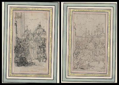
[Note: instead of writing a blog post this week, I have been playing hooky corresponding with peacay whose great blog BibliOdyssey is a marvelous source of images. Peacay dug up some rare drawings by Gravelot which he generously shared with me, and to avoid work we agreed to post our resulting exchange on our respective blogs. Peacay contributed the intelligent and classy portions. I contributed the mouthy opinions.]
**This cross-posted collaboration features an attitudinal stimulus package by David Apatoff of Illustration Art with peacay of BibliOdyssey on image wrangling and cattle prod detail.**
Hubert François (Burguignon) Gravelot 1669-1773 trained in Paris as an illustrator-engraver under François Boucher and came to London in about 1732. He was friends with William Hogarth and they both taught at the St Martin's Lane Academy, something of a precursor to the Royal Academy. Thomas Gainsborough was known to have studied under Gravelot.
From France, Gravelot brought with him the ornate styling of the rococo, which he helped promote in his thirteen year sojourn in England. He contributed designs for goldsmiths, furniture makers and the commercial print trade, but his book illustrations - for luxury editions - were particularly influential. He illustrated Gay's 'Fables,' Shakespeare and Dryden, and was one of the first artists to illustrate the novel, designing engravings for Richardson's 'Pamela' and Fielding's 'Tom Jones.'
Of the ten images below, the first eight were preparatory sketches for the 'Decameron,' the second-to-last from a Voltaire compilation and the final image is from an unnamed collection (links at the end of the post).
I've been told that one way to measure the quality of an oriental rug is to count its borders. Generally, the more borders around the rug, the more complex it is, and the higher its quality. But I usually find the opposite to be true of drawings: the more fancy borders required to make a drawing look important, the weaker the drawing tends to be. The owners of these Gravelot pictures have surrounded them with up to 14 borders and embellishments (some of them in gold) before you finally hone in on his drawing. Even then, we're not done. Gravelot encircles some of his own drawings with yet another ornate border-- a decorative wreath bedecked with the tools of the arts and sciences, or the symbols of the theatre, or fawning muses overwhelmed by the brilliance of what the reader is about to behold. By the time you finally get through to the drawing itself-- the image at the core where the artist demonstrates what his hand and eye and imagination are capable of-- the viewer has some pretty high expectations.
Unfortunately, I don't see a whole lot here to suggest that Gravelot's drawings satisfy those expectations. These are light, capable drawings. I can understand people preserving and studying them for their significance to the history of the engraving arts, or the manners and customs of his day, but not particularly for the quality of the drawing. Unfortunately, the quality of the drawing is usually the part that interests me the most.
When Gravelot was drawing these pictures, his artistic choices were limited by the fact that the drawings would have to pass through a cumbersome engraving process that was already more than 300 years old. First, the drawing would have to be transposed onto a wood block or metal plate. Next, the plate or block was turned over to an engraver who attempted to carve the image into the surface using sharp and unwieldy tools. This process effectively prevented an artist from drawing in certain styles; Gravelot could not get too spontaneous or fluid with his line, or use half tones in his picture. Finally, the printed picture ended up as a mirror image of the artist's original drawing. The result of this arduous process was a picture several stages removed from the artist's concept.
Not long after Gravelot died, photoengraving replaced engraving as the technique for reproducing art in books and magazines. The new technology set artists free and transformed the entire field of illustration. Delicate nuances in line, subtle gradations in color, detailed images were all reproduced with much greater fidelity, permitting artists to do their very best.
Gravelot may have played an historically significant role as a designer and engraver, but his drawing seems pretty anemic to me. You can see from these preliminary studies how often he has to go back to re-work simple figures he should have been able to visualize and lay out straightforwardly. [title page, outside crowd scene]. Note how tentative his line work is, and how heavily dependent he is upon mechanical tools such as the grid for his vanishing points. [kitchen scene, Imprimerie] Most capable artists could simply intuit perspective in drawings this small, with subjects this simple, but Gravelot's preliminary drawings seem to reveal a well deserved lack of confidence.
One of the purposes of an illustration is to help stretch the reader's imagination by providing an artist's vision of the story. It is ironic then, that illustrating a book as bawdy and rich as the Decameron, we are presented with such wan and lifeless drawings. It's hard to imagine that a reader could not do better on his or her own imagination. These illustrations seem to serve as a visual chastity belt, keeping our minds within legitimate boundaries rather than titillating and unleashing them. There is no commitment or emphasis here, no urgency or merriment in the art to correspond to these stories. By today's standards for illustration, this work seems like a real mismatch between form and content.
- 'Drawings for the illustrations of Boccaccio's Decamerone' {Rosenwald 1645} [book published in 1757].
- 'Théatre de Voltaire; dessins par Gravelot' {Rosenwald 1604} [book published in 1768]
- 'Original Drawings' {Rosenwald 1657} [undated]
- Biographical material: one; two; three.
- Art works: one; two; three; four; five.
10 Abstract Architecture Design Brushes for Adobe Illustrator
A stunning set of vector brushes for Adobe Illustrator from r2010. The pack contains 10 abstract brushes, after applying them to your stroke they will create an abstract architecture element based on its shape, width, height, size and color.
If you experiment with the opacity and the blend modes you can get some amazing effects. Perfect for creating abstract backgrounds.To use the resource first, you need to expand the *.ZIP file, then load the *.AI file in Illustrator and open the brushes palette (Window>Brushes).Download
Subscribe to:
Posts (Atom)