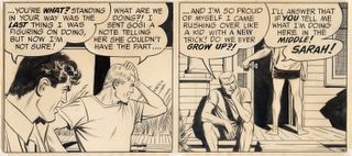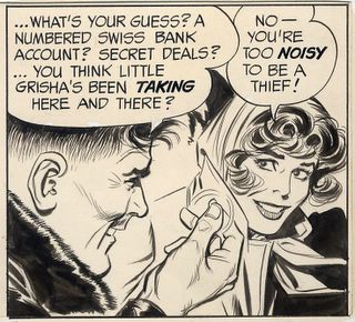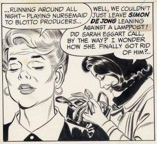
A panel from Drucker's "Patton"
Mort Drucker is the genius caricaturist who was a centerpiece of MAD magazine for decades. His ability to capture a likeness from many different angles and with a variety of expressions bordered on the supernatural. If Drucker had been born 500 years earlier, he might have been burned at the stake for witchcraft. But practicing his art on the pages of MAD magazine for almost 50 years, he remained safely below the radar of most people over the age of 18.
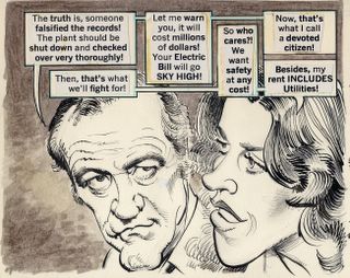
Drucker's Jack Lemmon
One of the most striking characteristics of Drucker's work was how liberally he dispensed his abundant talent. He was able to lavish creative attention on background details and inanimate objects without restraint. While other more prominent caricaturists such as Al Hirschfeld or David Levine might labor for a week over a single likeness in a fixed position, a torrent of superior drawings flowed nonstop from Drucker's miraculous pen. He might easily draw a hundred distinctive faces for a single issue of MAD, depositing them effortlessly in crowd scenes, or in a picture frame in the background, or even on a passing horse or dog.
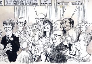
Note the complex architecture of a typical Drucker "background" crowd. Drucker's crowds compare favorably to the famous "group portraits" of celebrities by artist Ralph Barton that caused a sensation in venues such as Vanity Fair in the 1920s.

Theatre audiences gave Drucker an opportunity to indulge himself
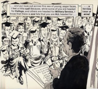
Another crowd scene, this time the hard way: over the shoulder of the speaker, from above.

Superfluous background characters each have a distinctive personality
It is difficult to think of an artist who doesn't start from a standard template when drawing the human face, either because their style hardens with repetition or because they resort to shortcuts to save time. You can spot an artist's standard presumptions about the human head, usually camouflaged by a few distinguishing details added at the end. This approach was apparent in the work of excellent artists such as Hal Foster (Prince Valiant) and Alex Raymond (Flash Gordon)as well as lesser artists such as George Wunder (Terry & The Pirates). But Drucker makes no assumptions. With each new portrait he seems to start back at the Garden of Eden and redesign the human head from scratch. Never has an artist drawn the head in so many different shapes and sizes. A garden of Drucker faces follows:

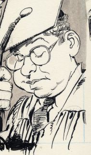
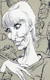

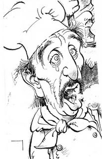
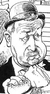
Drucker's brilliant drawings were all rendered in his trademark style, a springing, bouncy line that adds energy to each and every picture. (Drucker's forte was his line work. With a few exceptions, his color work was far less successful). One look at his pictures made clear that Drucker's jaunty line was based on a rock solid understanding of perspective, anatomy and composition.
In addition to being more prolific than other caricaturists, Drucker has the advantage of being a superb draftsman. While many caricaturists mastered portraiture, Drucker mastered anatomy and perspective and technical drawing so that he didn't share the limitations of his more specialized peers. Drucker's brilliance at all around drawing enabled him to transcend some of the limitations of the comics medium. While his artwork may be confined to tiny rectangular boxes, he is able to squeeze the illusion of great depth and scope into those spaces.

Drucker's understanding of anatomy and perspective makes him fearless about taking visual risks.

Drucker seemed to be able to squeeze limitless depth into a tiny panel
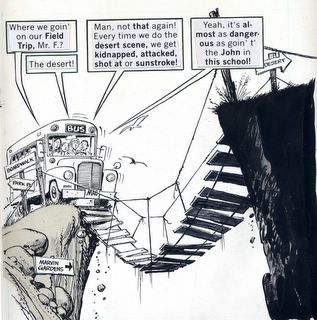
Another example of Drucker making the most of a small panel
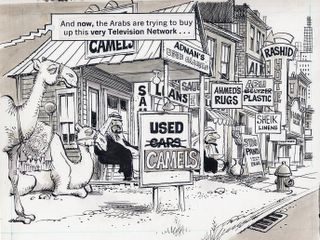
Drucker's use of perspective at work
On thousands of pages, he crowded every panel with dense images and still had enthusiasm left over for visual jokes and playful sidebars.
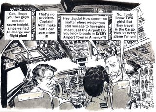
Drucker's enthusiasm for the act of drawing sometimes took him to bizarre lengths.
Drucker sustained his extraordinary quality over many decades, compiling an unrivaled body of work. To paraphrase Bohun Lynch, Drucker "had drawn so many caricatures that he must now wait for new subjects to be born."
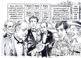
A panel from Drucker's "Godfather"
Drucker's one Achilles heel as a caricaturist seems to be the benvolence of his drawings. He seemed incapable of generating the type of nasty pictures that brought fame and notoriety to Thomas Nast or Daumier.
Those who swoon over the caricatures by Daumier found on museum walls forget that those very pictures originally appeared in the French satiric tabloid, La Caricature. They would do well to invest some time in studying a superior artist hidden in the pages of MAD magazine.


