Thursday 31 December 2009

Google New year Page rank update PR 3 For Myfundoo blog

Its a google style of wishing New year to All bloggers and site owner.Google Updates its page rank last On 31st of december .
From Page rank 2 to Page rank 3 Myfundoo-blog has grown up thanks to all my readers and blogger mates.


With this post being published i want to wish all my readers and friends A happy New year and best of luck for new decade.
So let me know ,what had happen to your pagerank??Did it change or not??


Check your pagerank :
Check Page Rank of any web site pages instantly:


2010


Well hello 2010! So nice to see you! :)
Isaiah 43:18-19 (King James Version)
Remember ye not the former things, neither consider the things of old.
Behold, I will do a new thing; now it shall spring forth; shall ye not know it?
I will even make a way in the wilderness, and rivers in the desert.

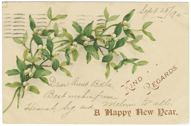
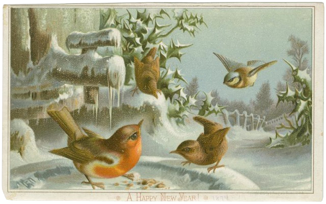
I found these beautiful vintage postcards at the Digital Gallery of the
New York Public Library

Happy New Year!


Video directed by Sou Ootsuki.

Tuesday 29 December 2009

The Splendorous Form of Noise

To see the following video you should enlarge it (double-click once playing).


The above is a compilation of works by the Swiss artist Zimoun.

1. Funny, one keeps telling oneself, enough of the minimal already, somehow feeling that less is a bore should be embraced, and the outrageously overflowing art of the recent years - appreciated and encouraged. And then, something like this appears, and it's irresistible. We've seen things from this universe before, also on this blog, and yet, the simplicity, yes, the damn purity takes over again.

2. I had a chance, recently, to visit several large factories. There were wonders there that could probably match most of the things on this video. Yet there was one thing they couldn't do: be useless. It's the sheer uselessness of it that gives it the power. We are not attached to anything but the thing. Art as the thing-that-cannot-be-used? Not necessarily, not in some purist sense. Great industrial design is to be cherished. And yet, there is a level of insanity here, of out-of-this-world-ness, that takes us to an exotic land, allowing for the silliest and most delicious connections to be made.

3. Luxury requires waste. A truly luxurious lifestyle is one where perfectly good things get wasted, as if to outplay their natural use and dying away. The true master of luxury seems to be saying her opulence is so great, the very perseverence of things is no match - they lose their original function and only exist to the extent they are participating in this out-of-this-world-ness of luxury.
You know what I'm aiming at? Here's the hypothesis:

4. This, this minimalist joyful pleasure-making, is the true luxury. Not the apparent richness of the new complexities. In the world of useless purity, everything only serves the joy of simple aesthetic pleasure. More complex works are not quite like that - they have an inner game to play. The elements enter a dialogue, start relations and societies, with their conflicts and functions and disruptions. Here, there is only the ping of a shot of pleasure. This engine moves nothing. It is here to make me smile (or bring inspiration, or scare) - and I turn it off as soon as I have. And don't be mistaken - if I had one of those and got bored with and could afford it, it would go to waste.

4a. Ah, you might say, but the truly great art is one we don't get bored with. Possibly. Yet how often do we actually go back to contemplate (not just think about or admire or analyze) a work of contemporary "minimalist" art? Does it mean it's because it's not that great? What if it's about something else? What if it is an element of luxury, a game we play with ourselves, to feel the exquisite taste of the sophisticated dish, and then to ditch it as soon as we're fed up? It wouldn't be a question of bluff, of fakeness, of shallowness. It would be a question of use. Of why we crave it, this new. Of how we make it useful after all.

David Foldvari, Wrestler


(via)

ON THE DIFFICULTY OF DRAWING WOMEN'S FACES

One could easily devote a long and joyful lifetime to cataloging the differences between men and women without ever pausing to consider the higher significance of those differences. That is certainly the safest approach.

But as the astute Goethe noted, "Nothing is harder to take than a succession of fair days," and every once in a while (usually at the end of a year in which one hasn't met his full quota of foolhardy behavior) a person will deliberately risk life and limb by exploring the significance of those differences out loud.

It is in that spirit that I set out today to consider why it is more difficult to draw women's faces than men's faces.

Artists quickly learn that men's faces are easier to draw because men have bone structures and muscle groupings that are more pronounced than women's. Male heads are generally more blocky and angular; they tend to have stronger jaws, square chins and prominent brows. These features provide artists with easy opportunities to employ distinctive lines, strong shadows and recognizable shapes to achieve a resemblance.


From the Famous Artists School course materials, "Constructing the Head and Hands."

Women's faces, on the other hand, tend to be smoother and softer, with rounder shapes and subtler, more delicate features which require greater restraint.

Another difference that makes men's faces easier to draw is that, "as the man matures he develops larger, deeper wrinkles while the woman develops smaller ones because her skin is finer textured and her bones and muscles are less prominent." If an artist wants to capture a likeness using lines, it is much easier if the subject has lines that were already mapped by nature.

Note in the following examples how men's sharper angles, prominent facial muscles and deeper wrinkles have provided artists with more tools for describing a form.


Here, Mort Drucker sculpts the male face, but on the woman's face he stops with just the outline. Her features can't be rendered effectively using the same kind of approach, and must be implied instead.


Here, Leonard Starr puts a strong chin, nose, cheekbones and brow on the man (while making it clear from facial expressions that the woman has the stronger mind).


Here, Norman Lindsay tries to deal with the difference between men and women by using small dots to convey the woman's features, while using lines for the man.

The special challenge of a woman's face is that it compels artists to describe subtler forms with fewer lines and less obvious shapes, depriving artists of some of the most fundamental tools in their tool kit. In the following image, Leonard Starr limits himself to little more than an outline of the face but nevertheless gives us important information about the contour of her cheek simply by leaning more heavily on his brush on portions of the right side of her face.


So what is the larger significance of these observations about the differences in drawing the faces of men and women?

Part of the magical power of drawing is that it can lead us unexpectedly to larger truths. The principles we encounter in drawing the faces of men and women often seem rooted in fundamental realities about the sexes:

Like their faces, men's personalities are more easily reduced to a line than women's personalities. Like their facial features, men tend to be more obvious than women. (Artists frequently bear witness to such triumphs of physiognomy!)

Women, on the other hand, are sometimes best understood implicitly and indirectly; the discipline of describing form without heavy reliance on lines requires subtlety, appreciation and restraint but you can sometimes achieve a far better likeness that way.

Regardless of whether these larger principles resonate with you, I am sure we can all agree that if an artist lacks the patience for the complexity of ambiguity, you can't compensate for that lack by substituting more (or more emphatic) lines of the type that you use for a man's face. In such situations, "more" will invariably turn out to be "less."

Monday 28 December 2009

Stylissimo three-column blogger template


"Stylissimo" is a three-column template with clear separation of the header, footer and the main container. The HTML/CSS code is well structured and commented which will make your implementation very easy.


15 Water Splash Brushes for Adobe Illustrator

Here we have a set of ten scatter and five art water splash brushes for Adobe Illustrator from r2010. You can use them for decorating your artwork or designing abstract background elements...

To use expand the ZIP archive, load the .AI file in Adobe Illustrator and open the brushes palette (Window>Brushes / F5). Download

This work is licensed under a Creative Commons Attribution 3.0 License.

Now you have new brushes for your web design, it's time to look for web hosting plans that will fit your budget.


The Logo Design Process. Layers Magazine Tutorial

In this tutorial Jacob Cass takes us through the different stages of the logo design process: researching, composing a design brief, sketching, reflecting, developing, color brainstorming and presentation...

"Logo design in today’s world is totally underrated. People don’t understand how important a good logo is and how valuable it is to their business. Let me guide you through the basics of what makes a good logo, while also walking you through the process of creating the identity and logo design for one of my recent clients, Vero, a limited liability company based in Miami, Florida. Hopefully, this will give you an understanding of what actually goes on behind the scenes while creating a professionally designed logo..." Proceed to tutorial page

Best Places to Download Bullets For your Blog

Download Free Bullets Graphics/Icons For your Blog(Best On web)

1.Free websites bullets dot com
With Over 750 free bullets and web arrows and in five different colors with a promise to update soon is on top of the list.Brought to you by the Xemion.com


2.Free social icons net works and bullets
Here you canfind bunch of social networking icons bullets ,buttons ,icons etc some of them has been added on the blog.
extension fm
3.Freeiconsdownload.com
twotone, is now 100% free. every icon in the set, every colour, and the PSD to change the colours to whichever custom colour you want. you can use it on your blog, website, application or intranet.


4.Led Icons Set
LED Icon Set v1.0 are designed for web designers/developers by Aleksandr Kozmenko. These .png icons make a professionally looking icon set and are totally free.


5.Random bullets Image taken from all over the web.
Right click and "save image as " to save it directly to your dextop
uipageindicatorcurrent21 uipageindicatorcurrent4 uipageindicatorcurrent10 uipageindicatorcurrent3 uipageindicatorcurrent9 uipageindicatorcurrent11 uipageindicatorcurrent5


ice_deliice_diggice_rss1ice_stumbleupon

57 59 60 star4 star1 star2 star6 star5 kobana_1 kobana_3

.