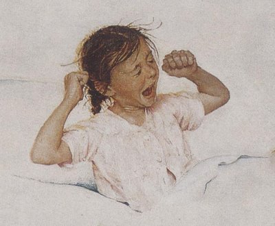
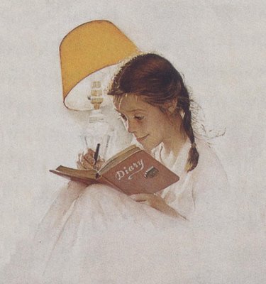
In the words of Roberta Smith, "drawings are a direct extension of an artist's signature and very nervous system." The humble act of making a line with sensitivity and grace is one of the defining acts of humanity; it's the first thing our ancestors did when they evolved from Neanderthals to modern Cromagnons. So what are we to conclude from the state of drawing today? Artists such as Art Spiegelman and Chris Ware seem to be the current darlings of the illustration community, but largely because of the content of their message. Let's face it-- their drawing is just plain lame.

Chris Ware
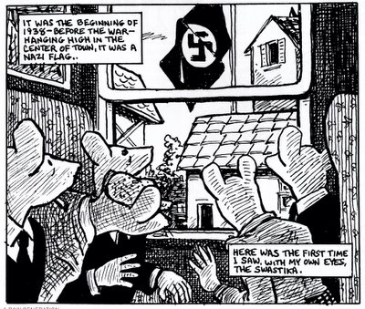
Art Spiegelman
In fact, a great many of the artists who helped shape the course of illustration over the past several decades-- Seymour Chwast, Edward Sorel, Garry Trudeau and others-- seem to lack fundamental drawing skills. To their credit, they don't try to conceal it. Chwast is among the first to say that he avoids techniques and media "that require craftsmanship and a drawing ability that I do not have." Sorel admits, “I have never had the confidence that I could draw.... To me, a person with drawing skill is a guy who can sit down to a piece of paper and draw upon his familiarity with the body and with gesture, and do whatever he wants to do.”
The message of their art may be brilliant, but most of them could not have found jobs as an apprentice sharpening pencils in the era of Noel Sickles, Robert Fawcett or Austin Briggs. There are thousands of marvelous drawings out there by now-forgotten artists whose work is far superior to the work that currently causes the critics to swoon. To illustrate the point, let's look at some random examples of quality drawing. Compare the contemporary "masterpieces" above with the vigor and complexity of the linework in this sketch by J.C. Coll :

Some illustrators argue that, as the illustrator's message becomes more important, the need for a "slick," polished image diminishes. Yet, the brilliant Ronald Searle repeatedly proved over the past 50 years that an illustrator does not need to sacrifice artistic quality in order to convey biting content:

For another example of visual form worthy of its content, look at this fabulous, robust drawing by Jean Dubuffet, appropriately entitled "pisseur a droite." The drawing is just as powerful as the subject matter, and it makes the contemporary drawings above seem anemic by comparison.

Here is yet another approach: Alex Raymond could always be counted on to wield a pen and brush for a sparkling effect. Each of these four artists artists draws with a strength and a humanity that is often absent in an era where so much art has been processed through the photoshop deflavorizing machine.

How can we explain our hypogeusia? For one thing, our primary interest in art seems to have shifted from aesthetic quality to intellectual content. Arthur Danto, the art critic for The Nation, observed:
The way things have evolved, art can look like anything, so you can't tell by looking.... [A]rt these days has very little to do with aesthethic responses; it has more to do with intellectual responses.
This is what happens when we draw with our brains. From my perspective, "intellectual responses" are dandy but they can't begin to compensate for the decline in aesthetic quality. I am, however, eager to be instructed by those who understand "concept" illustration better than I do. There are plenty of you out there because I see your worshipful blogs to Ware, Spiegelman etc. all over the place. You're the reason I wrote today's entry. Please comment and explain where I am missing the boat!