Saturday 29 April 2006

ONE LOVELY DRAWING, part five


Paging through Victorian era magazines you will find thousands of dull, unimaginative illustrations that long ago ceased to have relevance to anyone. But every once in a while you find an illustration that leaps off the page, grabs you by the lapels and shakes you. The rare artist with "the spark" still stands out.

Most of his peers have been blissfully forgotten, but English illustrator William Hatherell (1855-1928) had "the spark" and deserves to be remembered for it.

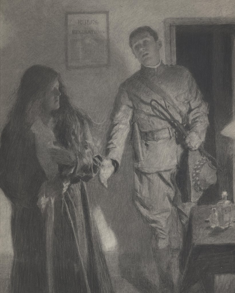
This drawing overcomes every disadvantage that the world could throw in its way: working in black and white with charcoal and wash, reproduced in a publication with poor printing quality in a period when the prevailing style was largely fusty and stolid, Hatherell produced a picture of striking strength and vitality measured by the most modern standards.

His composition has all the verve and excitement of an illustration from America in the 1960s. His potent use of values, his vigorous strokes and the careful placement of figures result in a picture more dynamic and lively than much of what is produced today using the latest computer graphic technology. It just goes to show you that even if you are born in the wrong place and time, working with the wrong tools, sheer talent can do a lot to level the playing field.

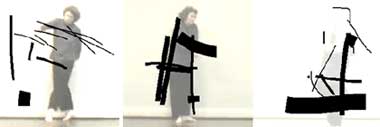
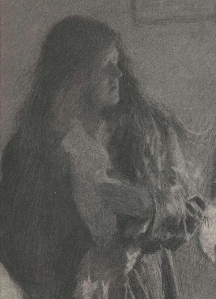
I don't have access to the original of this drawing by Hatherell, but I am attaching below some details from another one of his drawings so you can see his technique.


Hatherell worked on the staff of a magazine called The Graphic starting in the early 1890s.


In less capable hands, this drawing would lapse into a nondescript puddle of gray. Only Hatherell's mastery of value maintains the integrity of the picture.


You won't find much of his work around these days, but this was a man who could draw.

Wednesday 26 April 2006

Work

I have been working hard on a performance by Performaria, an academic group I'm directing. And also, in the free time, seeing films at the Indielisboa festival. I hope to bring more on all of the above soon.

Sunday 23 April 2006

DAVID LOW: TAKING AN EXTRA DAY TO MAKE IT LOOK EASY


Perhaps the best political cartoonist to emerge from the smoking cauldron of World War II was David Low. The power of his simple, clear drawings took him halfway around the world and protected him from many forms of censorship.


Low was born in a small town in New Zealand in 1891. He learned to draw from studying the pictures in old magazines in the back of a second hand bookshop. The popular style when Low was growing up was fancy, elaborate linework the way Charles Dana Gibson, Charles Keene and Norman Lindsay drew. Low wanted a simpler, cleaner look. His goal was to combine "quality with apparent facility."


Low's direct, powerful style stood out from other editorial art of the day and brought him to the attention of local New Zealand publications, which then brought him offers of employment from Australia, and later from England where the richest and most powerful newspapers bid fiercely for his services. From this forum, Low waged a brilliant graphic assault on the Nazis.

Low's art was not as simple as it looked. He later wrote, "making a cartoon occupied usually about three days: two spent in labour and one in removing the appearance of labour." You can see Low's hard work below the surface in the beautiful body language and facial expreessions of Stalin and Mussolini singing above, or in the salutations of Hitler and Stalin below. Note the tilt of the heads and the angles of the bodies. These are wonderfully choreographed drawings with simple, powerful darks and whites.


By studying the originals up close (see next image) you can see just how blunt and uncluttered Low's brushwork was. He worked large-- a typical cartoon would be 14 x 17.


I love Low's no-frills drawing. Its honesty and toughness stood up to many a powerful enemy. Low was an ardent socialist but he was so good that the staunchly conservative Lord Beaverbrook begged Low to come work for Beaverbrook's newspaper, The Evening Standard. Beaverbrook promised to double Low's salary and give him complete artistic freedom. Beaverbook later grumbled that Low was trying to comandeer the whole paper's editorial policy, but he never dared to censor Low's voice.


Hitler was enraged by Low's scathing drawings, and the Nazi government formally requested that the British government "bring influence to bear" to stop Low. However, nothing was done. After World War II, objections came from the opposite side of the fence: Winston Churchill claimed that a cartoon about the situation in Greece should be blocked "in the interests of western democracy."


Once upon a time, the ability to draw with strong, clear lines and a sharp eye could take you from a small town in New Zealand to the center of the world stage in London where powerful publishers and world leaders would rail against you, to no avail. Low was ultimately protected by the beauty and directness of his work.

Christian Tedeschi


I believe in art that one trips over,
Tumbles blindly
Down several flights of stairs
To end up on their own two feet.
Virtually unscathed, and
Into the arms of their sweetheart.
- says Christian Tedeschi. And it is true of his works: at first glance they seem scary, dangerous, aggressive. But once we look more carefully, we see a light-heartedness that enchants. For once, the heavy matter turns into crystal form. For once, Beuys is misundertood as he should be, without the huffing and puffing of someone too old to be a disciple. And so, the matter dances and plays. It swirls in the air as if it weren't suspended. It moves by itself. But don't be fooled - it does nothing of itself. Even if it takes 10 seconds to reorganize it, the world stands anew. Enthropy? Erosion? A gentle spin of time?

Saturday 22 April 2006

A Glimpse of Infinity?


Camera Obscura 2005/1-Inf is a worldwide project in which two holes of a twin-holed pinhole camera are being auctioned simultaneously on Ebay every week. This project is dedicated to the polish artist Roman Opalka and his work 1965/1-∞. The highest bidders in each case receive one after the other a pinhole camera loaded with a piece of unexposed sheet of 5x7 Inch b/w film.
There is a sense of global fraternity and timelessness in this project that's appealing. Opałka is a great reference to have - he is an artist I have come to appreciate and there is much to learn from him. One of the things is persistence. Another is discipline. Yet another, choosing the right format. If you get your format right, the work works with you, if not for you.
I'm not convinced that the authors, Przemek Zajfert and Burkhard Walther, figured out the format right. Not that it's bad - it works, and the kaleidoscope of scenes actually starts to develop. The actual photos must be immensely more interesting, with details we can barely figure out or imagine on the net (the quality of the posted pics could be better!). Still, that's just one part of the picture. Another is the question of, well, infinity. Of time. Or rhythm. Or a key of some sort. In this case, there is none. Time is gone, there is no development, and the pictures represent - whatever someone wants them to, plus the usual pinhole surprize. And that's a pity. One could easily imagine a slightly more disciplined version, with a "theme", or some rules that would create a more coherent whole. Otherwise the risk is getting simply too creative.
(Below - images of Opałka's work.)


Wednesday 19 April 2006

Cattelan's perverted victory


Of course, it's not his fault. He simply made the art. And if someone interpreted it wrong, well, they interpreted it wrong.
As many of you know, in 2004 the Italian sculptor Maurizio Cattelan hung three plastic dolls of children from Milan's oldest tree.
Shortly after being officially "open", the exhibition came to a sudden end: Franco De Benedetto, a Milenese man, decided to cut the children off. He cut two ropes, but swayed and fell when cutting the third one. He was injured and taken to hospital.
Cattelan graciously didn't press charges, but the city of Milan did. And won. De Benedetto will be spending three months in prison for destroying a work of art. Mind you, it took them nearly two years to establish this was indeed a work of art, as that was the prosecution's main argument.

Some say he simply misinterpreted the nature of the work:
Maybe, as the ambulance blared through the Milan streets, di Benedetto was moved to reflect on the violent collision of two types of judgment: civic and aesthetic. He seemed to have mistaken one for the other; or rather, he’d disallowed the second as soon as he set out on his hapless clamber.
I quite disagree. I think the whole work was based on the game between a work of art and a "natural" surrounding. As it is often the case with Cattelan, it was supposed to create uncertainty about the exact role of the work. Only here, it could easily bring uncertainty as to whether the sculptures were real or not.
In places where guns are illegal it is also a crime to pretend one has a gun. Even if you said it was a work of art, you would still be inciting a certain type of behaviour, suggesting a certain reality. I believe this is exactly the case here. This is not to say Cattelan is a criminal, case closed. Not at all. But since he plays in the real world, he should accept the real world's rules. And he does - by neither accusing De Benedetto formally, nor insisting on hanging the children again. But he creates a situation and then washes his hands, as if he wasn't its author. De Benedetto hurt himself and wound up in the hospital. This should be enough. The contact between art and reality is made quite explicit in this fall. The score seems so naturally set. Why go further?

Monday 17 April 2006

3 pics of people by Ron Mueck


What I like in Ron Mueck's work is not so much the "life-likeness" of the figures (that has been done and re-done). It is their dramatic character, their theatricality. They have their stories, personalities, they are not types of people (like Duane Hanson's characters often were).
The pictures come from the Washington Post and have an added value: they create stories between the sculptures and the onlookers. This performative play, this superimposed dialogue, is a blessing - it takes our attention off the "look how real it looks" aspect and shows another level in the naturalistic technique.

Sunday 16 April 2006

Writing down the dance

The history of contemporary dance knows many attempts at pinning down the choreographic composition. None of them is perfect though - and the main flaw is that they are mainly character-based, i.e., they create signs to represent movements. This semiotic approach has obvious limitations - the purity of movement, its dynamic and time is gone. Also, it takes a long time for someone to understand how a system works, so as to repeat it, or even read it correctly.
Simply recording on video also isn't enough, as it lacks all the advantages of symbolic transcription: yes, you can see what's happening, but how are you to explain it? How are you to know if what you're doing is the same? It all requires quite a lot of imagination, and one usually ends up confused and unable to really "get the real thing".
So how is a choreographer to mark down what he's come up with?
Here is a new, pretty solution:

Rotosketch is an intuitive tool for sketching, doodling and notating on top of video, such that the marks that are made are linked in time with the video. This allows the user to draw strokes along the the axis of time, as well as the normal x and y axes, and for those strokes to augment, analyze, interpret, or even obliterate a video sequence.
00rotobo.jpg

ps: Following the comment that "this has been done before. done a lot":Yes, it has. Using software to work with choreography has an entire history, that goes back at least to the great Merce Cunningham's 1989 performance with the program Life Forms. There were - and are - many other choreographers and programmers that followed. I'm not specialist on the matter - read more about it here and here and here. (Some examples of software are Isadora, the Choreograph, the Chaographer and the Interactive Choreographic Sketchbook). However, what seems to me particularly appealing about the Rotosketch is a combination of factors: 1) the possibility of including time as one of the variables in the sketch; 2) the "photoshop" characterisics that make it easy and intuitive (just use the pen and pad...); 3) the availability of the software (free download on the net); 4) the possibility of playing between the level of choreography and drawing. As you can see on the video, the sketch is really an interpretation of the draughtsman/analyst, allowing for a more personal, less software-dependent approach.

(via)

Saturday 15 April 2006

ADULT CONTENT IN A CHILD-LIKE PACKAGE


For most of the 20th century, the primary gripe against illustration was its simple-minded content. No matter how talented or skillful the artist, illustrations for silly romantic fiction in women's magazines or childish advertising slogans just could not be taken seriously.

How odd, then, that in recent years this situation has completely reversed: we have changed from sophisticated illustrations of cartoonish subjects to cartoonish illustrations of sophisticated subjects. Illustrators now deal with the most adult and graphic content, but do so using simple, child-like forms.


Art Spiegelman's crudely drawn comics of talking mice confronting torture and genocide in Nazi death camps won Spiegelman a pulitzer prize.


Child-like pictures by Debbie Drechsler convey blood curdling stories of incest and molestation.


Chris Ware portrays bleakness and alienation using simplistic diagrams reminiscent of industrial instruction manuals.

This trend is evident from the changing mix of artwork in the annuals of the Society of Illustrators. It can also be seen in the work of the "new illustrators" group, the "concept art" crowd and the innovators behind "Raw." What is happening here? Why have form and content switched places in modern illustration? And what does that say about the evolution of our society?

I suspect that there are multiple forces at work. Clearly, illustration lost much of its ambition for technical skill as it fled from the path of the camera. There was not much point in investing years of rigor and discipline to develop skills if illustrators (and the publications that sustained them) were destined to lose the battle to television and photography anyway.

It also seems pretty clear that many of today's innovators didn't want to compete on the home turf of the great illustrators who preceded them. Seymour Chwast confessed that he stays away from techniques and media “that require craftsmanship and a drawing ability I do not have.” Elwood Smith, another highly regarded "cartoon-style" illustrator, recounts that when he tried to draw like the twentieth century “old master” artists with pen and ink, he simply couldn’t do it. But, he says, his inability to render the picture in his mind leads to greater innovation: “if I can’t draw it, I struggle to come up with a different idea that’s invariably more original.” The same could be said of a number of other contemporary illustrators who have shifted the direction of modern illustration.


But there are other, more legitimate reasons for the transformation to child-like styles. Recently, it seems that audiences and creators have become so saturated with mature content that they have become virtually shock proof. It is hard to envision a single vice that has not received ample, repeated and graphic airing. Perhaps for that reason, artists reach for simple, child-like images to reach audiences at a more susceptible and vulnerable level.

The great Mark Twain found that he could create a fresh perspective on adult corruption, greed and slavery by describing them through the eyes of an innocent young boy, Huckleberry Finn. Ever since then, artists have made creative use of the contrast between adult and child-like in various combinations. In the 1950s, Charles Schulz revolutionized the comic strip by putting adult wisdom in the mouths of simply drawn little children. Mel Lazarus used a similar approach with the beautifully drawn Miss Peach.

One interesting example of this trend is the use of a simple and innocent 1950s visual style from Disney animated movies and Golden Books to convey a more wicked subject matter. This juxtaposition of form and content can evoke surprising reactions. One of the very best at this is Shane Glines, a creative and prolific young artist with an excellent design sense.


Another such artist is Dean Yeagle. These two, along with other illustrators, seem to be mixing spicy content with innocent images in creative ways. I enjoy their work.


There is of course a larger issue that I have not addressed yet: why do illustrations with mature content but mediocre drawing merit museum shows, laudatory reviews in the New Yorker and pulitzer prizes, while illustrations with simplistic content and superb drawing are chronically snubbed? For example, comic strips like Flash Gordon by Alex Raymond (which had brilliant drawings of goofy stories) will never be accorded the respect that comic strips like Maus or Jimmy Corrigan (which have unimpressive drawings of serious stories) receive. As you might imagine, I have some thoughts on this too, but I have blathered on far too long for one day.

Condom for Mobile Phone


Wednesday 12 April 2006

Oscar Guzman: the surface of dreams

It is not quite as the artist, Oscar Guzman, would have it - those images are not photos. We can hardly say they have "characteristics of a photographic record", as the author puts it. They are clearly painted, in a style resembling some computer games. But that's where similarities stop.
I remember playing a flight simulator with my brother some years ago. We ignored the supposed objective of the game and simply kept flying around, enjoying the view. That is how I feel watching these wonderful city landscapes - as if I discovered another way, another level.
It is clearly the level of dreams. The architecture of dreams (hence some echoes of surrealism). The urban dream life. But it doesn't let me dive into it. And that's where the photo analogy becomes useful: here, I stay on the surface. I have evidence that this world exists, but nothing beyond that. These blurred figures are all I'll ever get - they are pictures of a lost civilization. And the association with computer games/graphics makes the civilization a truly unexpected discovery.
PS.: I have just one objection. I would rather not see the focused faces on some of the pictures. They refer me to a particular region, culture, part of the world. I think it's a pity, and not necessary to make our grey cells work.
(via)

Tuesday 11 April 2006

STEINBERG AT PLAY


© The Saul Steinberg Foundation/Artists Rights Society (ARS), NY

In the whole long clanging pageant of art, no artist ever combined words and pictures the way that Saul Steinberg did. He was truly an original. When Steinberg died, art critic Robert Hughes wrote, "He had no equals. Now he has no successors." The critic and philosopher Harold Rosenberg noted with admiration,"there is only one of his kind."


© The Saul Steinberg Foundation/Artists Rights Society (ARS), NY

Steinberg dealt with the most immense and challenging issues of the human condition. New York Times art critic John Canaday wrote, "Steinberg is the great artist of the post World War II quarter-century and maybe, for all we know now, the whole latter half-century." But for all his depth and brilliance, Steinberg had a playful side that showed itself in simple little word pictures like these.


© The Saul Steinberg Foundation/Artists Rights Society (ARS), NY

These drawings reveal Steinberg's imagination at the granular level. He was quite capable of constructing elaborate, multi-tiered works of great profundity, but unlike today's image-conscious artists who work with press agents to shape their image and protect the mystery of their creativity, Steinberg was never afraid to put these little drawings on display. To borrow a phrase from Issac Stern, these drawings "make it so simple that you can't cheat."

I admire Steinberg as much for his backbone as for his clear artistic gifts. He was never afraid that his playful cartoons would dilute the brand of his museum paintings and sculpture.


© The Saul Steinberg Foundation/Artists Rights Society (ARS), NY

I have used this blog to disparage "concept artists" who delude themselves that the high falutin' content of their message will redeem their otherwise meager artistic talents. Steinberg is one artist who got it right-- brilliant content married to a strong and excellent visual form.


© The Saul Steinberg Foundation/Artists Rights Society (ARS), NY