Tuesday 28 February 2006

What do stencil artists have to say?

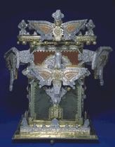
A recent work by Banksy, around L.A.

THE DIFFERENCE BETWEEN TRAGEDY AND MERE MISERY


Fans of Chris Ware, Art Spiegelman and other popular graphic novelists patiently explained to me last week that I am wrong to expect "slick, commercial" design in art that deals with higher truths about alienation and the tortured soul of the artist. Technical skill may be important for commercial art used to sell Coca-Cola, but is less relevant to today's more honest and personal artwork, with its tragic or subversive messages.

I admit it's difficult to criticize Maus or Fun Home merely because the authors do not draw well. But personally, I don't think the epithet "commercial" is a useful tool when seeking out quality art. Many bad pictures of sincere, personal subjects can be found hanging in art museums. Many brilliant pictures of dishwashing detergent can be found in magazine ads. As far as I know, nobody has yet established a connection between purity of motive and quality of picture.


It may be sad that, as Thoreau remarked, "most men lead lives of quiet desperation," but after reading Chris Ware, we might wish that desperate men would be a little quieter.


If artistic purity is what matters to you, I'm not sure you'll find much difference between commercial illustration, graphic novels and the pictures hanging in the Museum of Modern Art. They are all commercial. (Andy Warhol famously remarked that "good business is the best art.") Instead, try setting your sights a little higher and check out the true "outsider" artists. If the stink of commercialism offends you, you have to be prepared to hang around artists who don't use soap regularly.


Henry Darger


Often untrained, working in obscurity and poverty, ignored by the New York glitterati, "outsider" artists work only to serve their god or their muse, or sometimes their alien leaders on the planet Zarbtron.


For example, the artist Henry Darger was an impoverished janitor and dishwasher who lived for 50 years in a shabby apartment so tiny he had to sleep sitting up. He worked late into the night illustrating his magnificent graphic novel, In the Realms of the Unreal.


Henry Darger

Darger led a life of isolation and pain that makes Jimmy Corrigan's life look like a day at Disneyworld. Yet, Darger's artwork is filled with dazzling images. He did not use his suffering as a justification for ignoring composition, design, color or the other standards inherent in his chosen medium. His beautiful pictures were able to advance, rather than work in opposition to, his troubling personal message.

It is also worth noting that Darger never dwelled on his own suffering and insecurities. Instead, he elevated his personal misery to epic tragedy with his art. You will find no self-obssessed whimpering in Darger's work.


Henry Darger

Darger kept these exquisite illustrations to himself until the day he died. He was not working to impress the critics or harvest royalties. He used art to struggle with his own personal demons.


Henry Darger

Another "outsider" artist, James Hampton, was a janitor who lived a lonely life of poverty. Beginning in the late 1940s, Hampton began writing about his religious visions using pictograms and secret codes.


He drew marvelous symbols such as lightning bolts and omniscient eyes. Hampton spent the last fifteen years of his life integrating these symbols and pictograms into astonishing sculptures comprised of aluminum foil, light bulbs and pieces of old furniture.


He called his strange and beautiful masterpiece, "The Throne of the Third Heaven of the Nations' Millennium General Assembly."


James Hampton

Like Darger, Hampton was not out to impress Art News. He did not whine or complain about the unfairness of life. Hampton's own landlord had no idea what Hampton was up to. After Hampton died, his landlord was shocked to discover Hampton's masterpiece in the unheated garage where Hampton had labored all those years.


James Hampton

The Throne of the Third Heaven is made up of 177 separate art objects, combining words, symbols, drawings and sculpture. Standing before it, the cumulative effect is enough to inspire dread for your immortal soul.


Although they never received recognition during their lives, the work of Darger and Hampton is superior to anything I have seen from Spiegelman or Ware. Darger and Hampton worked with greater handicaps, under more difficult circumstances, and yet made better art.


There is also an important philosophical difference here, which should probably be irrelevant to a blog about illustration, but which I confess colors my judgment. It seems to me that the artistic response of these outsider artists to personal pain and the weight of their humanity was a more noble, less self-indulgent response. The guys who seem to know the most about this tragedy business-- Shakespeare, Aeschylus, Sophocles, Euripedes-- remind us that suffering and doom are an inescapable part of the human condition, and that our only meager defense is the tragic hero's capacity to elevate mere misery into the majesty of tragedy. This is done through courage, perseverance and understanding in the face of hopelessness. (Not much of a consolation prize, I admit, but hey, what other options are you offering?) My purely subjective judgment is that Jimmy Corrigan dwells at the misery level, and I find no nutritional content from visiting him a second or third time.


One of my readers, in explaining where I've gone wrong, compared Chris Ware to Shakespeare. In my view, for all his sincerity, Chris Ware's work is artistically feeble compared to Darger's.

There are of course thousands of other "outsider" artists, some making beautiful art, some making terrible art. But if you genuinely reject "commercialism" in art and strive for artistic purity, put down your graphic novels and invest a little time with real outsiders.

Goldmine Shithouse - The Clown Flippers

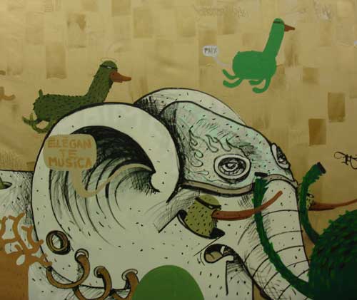
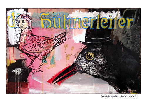
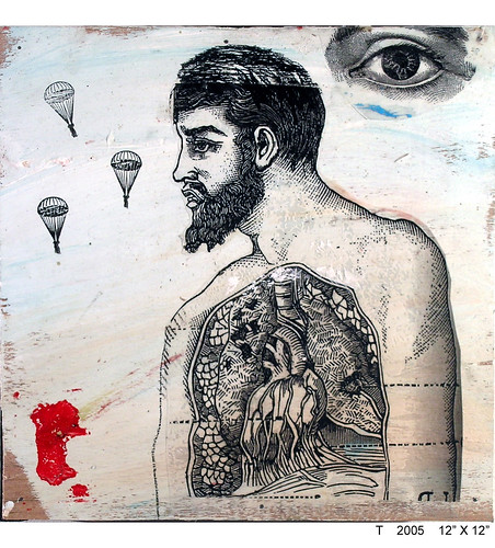
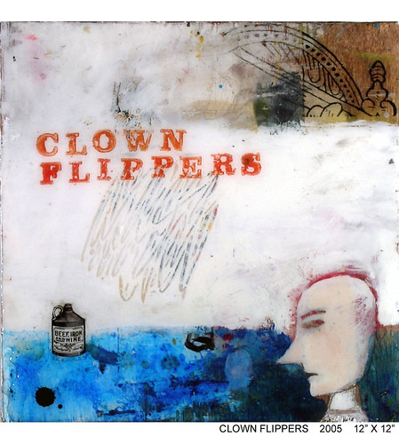
Before I post something more extensive about the "recent" grungy, stencilated and mashed-up aesthetics in fine arts, let me introduce you to the Goldmine Shithouse collective. They started off as a fairly loose group of artist friends, who would meet once a week to stir things up, which they then proceed to do. One of them would start a painting, and then pass it on to others. Each work was a chain creation. Out of this group, three people remained: David Hochbaum, Travis Lindquist and Colin Burns. They liked the way it worked for them so much, they started exhibiting their works. It worked. And it is still working three years later.

Saturday 25 February 2006

ERICH SOKOL


John Ciardi once said, “Modern art is what happens when painters stop looking at girls and persuade themselves they have a better idea.” Since we've been rambling for the last few weeks about modern art trends, I thinks it makes sense to heed Ciardi's advice and spend a moment visiting the paintings of Erich Sokol, the gifted illustrator / cartoonist for Playboy magazine.


Sokol had a splendid sense of light, color and atmosphere. He was far more talented than traditional pin up artists such as Vargas, whose vacuous paintings now sell for tens of thousands of dollars.


Note the confidence with which Sokol handles the stripes of light on the beach in the following painting, or his treatment of the foliage in the background. Nothing is labored, and no unnecessary details.


Although the beautiful girl was always the centerpiece of the cartoon, if you look closely you will see that Sokol had more fun painting the male counterpart-- the fat doctor, the grizzled farmer, the blustering general all left him more room for creativity.


Thursday 23 February 2006

I'm not sure


what this is, but I like it.
link

The Finger

The above emoticon, by Dan Wade, is dedicated to the Montreal fashion students fighting for their right of expression.
And the following picture (The Red Ball No.1 (2000)), by Loretta Lux, is a counterbalance.
Oh, how I love the static taste of play!

(via)
A scary list.

Tuesday 21 February 2006

Is a Fake Pollock Better?


May not a Pollock forgery that passes for authentic be the best Pollock of all?
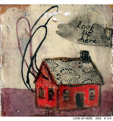
- asks Don Foster in a recent article in N.Y.Times.
Here is a more of the article, which will soon be unavailable for free reading:

LAST year, 24 paintings were unveiled as previously unknown works by Jackson Pollock. (...)

But Richard Taylor, a physics professor retained by the Pollock-Krasner Foundation to subject six of the paintings to computer-assisted analysis, discovered that the paintings may well be fakes — at least, the drips lack Pollock's characteristic geometric pattern. The collection's owner disputes that this finding is conclusive.

At the heart of the controversy lie critical questions about artistic meaning and value that have vexed literary scholars no less than art historians. Would the exposure of a hitherto successful forgery diminish Jackson Pollock's reputation as a unique creative genius, by demonstrating that his work is replicable? If Shakespeare were credited with a mediocre poem hitherto presumed to be written by a lesser light, would that change our opinion of Shakespeare?

"What matter who's speaking?" asked Michel Foucault, quoting Samuel Beckett.

What matter whose painting? The implied answer — no matter at all — takes for granted that cultural artifacts are symptomatic of the society that produced them. The critic's job, then, is to assess the product on its own merits, quite apart from the artist's name or reputation. If "Hamlet" had been written by Christopher Marlowe or Edward de Vere, not by William Shakespeare, would the text therefore be less great? Perhaps not, but we would think of it in a different way.

If a previously authenticated Pollock painting was actually done by a disciple, or by Norman Rockwell, or by a monkey with a paintball gun, yet looks to be authentic Pollock, so what? The look-alike might be worth less at Sotheby's, but would it be worth less as art?

At stake in such attributional debates is a question of methodology: how can experts tell the difference between the real thing and an imitation? If the qualitative judgment of Pollock or Shakespeare scholars differs from quantitative analysis of a computer-assisted study, whose verdict will carry the day? That Richard Taylor's analysis can inform us of patterns generated by Pollock much of the time provides no guarantee that Pollock reproduced those patterns all of the time. But if the Pollock canon includes a forgery, it may be that Taylor's analysis provides a more objective mode of analysis than aesthetic appreciation.

(...)
In the art world, the problem of attribution is complicated by market value.(...) if you have paid, say, a half-million for a Pollock painting and some physicist and his computer say that you were hoodwinked, the question of the work's value is not wholly aesthetic.

Literary and art attribution is not just a game of pin the name on the donkey. A community of interested scholars must consider all available evidence, and come to a consensus. In the case of the Pollock canon, the jury is still out. It would be a mistake, in my opinion, to sell the disputed Pollock canvases at a discount without more evidence than computer-assisted analysis of drip patterns.

Meanwhile, Jackson Pollock may be chuckling in his grave: if the object of Abstract Expressionist work is to embody the rebellious, the anarchic, the highly idiosyncratic — if we embrace Pollock's work for its anti-figurative aesthetic — may faux-Pollock not be quintessential Pollock? May not a Pollock forgery that passes for authentic be the best Pollock of all?


Well, may it not? This question joins the recent Duchamp controversy and many, many other cases where an artist's desire for artistic freedom seems to be forgotten when his works are judged by computer programs or valued for their size, or put on a pedestal and turned untouchable.
There is one factor, however, that tends to be forgotten in all our excitement about the real meaning of art and its heroes. I mean psychology of art. Namely, two points about it:
1) As art viewers, we feel the need for coherence. The work has an artist, the artist has an identity, the identity is not just some drips of paint scattered across the canvas of the soul, but it is a whole, it makes sense. In this case, it means a) Pollock was a painter; b) Pollock was a good painter; c) Pollock's paintings are related to a) and b); finally, d) we can expect that Pollock's work can only be his (there are recognizeable patterns, then).
This final point is the most questionable, and obviously we often fail at it, misjudging a work, attributing it to the wrong painter, etc. But our failures are only more proof of the possibility of success. And if we wish to name some of the 20th-century works of art that are based on "anonimity", such as Yves Klein's exhibition of air, we must notice that they were conceptual works of art, and we are ready to pay either for the event (as a performance of burning money), or for the signs of the concept (as the partiture of Cage's 4'33). The silence, the air, we somehow don't actually assign to the artist. Earth, after all, is not Manzoni's.
2) Reality check: artists aren't always right. Not even about their own work. Pollock might have dreamed of " the rebellious, the anarchic, the highly idiosyncratic", but he never moved beyond the canvas (he never even made the tiniest hole in it, as Fontana ever-so-modestly mentioned). Artists say a lot of things. And dream of even more. That's our job. If we don't dream, something is wrong. As Jules Verne put it, there are no great achievements without exaggerated expectations. But if this is true, we simply cannot take the artist's word for it. Or at least, we don't need to. Not even when they're dead and famous (what a scary combination!). That's why we might just pay more attention to our way of seeing The Fountain, or a drip painting, than to that of the artist. After all, if we listened to the wonderful, charming futurists, we wouldn't even know them.
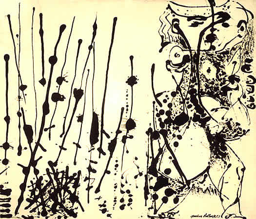
I suppose if we join the dots 1) and 2), we see that the artists need a story and we need one. Trying to make us forget any story and see the "pure drip value" of a Pollock seems absurd. On the other hand, promoting the avant-garde tendency towards anarchy as a way of promoting the very artists that lived this tendency is, well, silly. Damn it. We actually need the library, and we need the museum. And some of us, yes, would like to know if the drip-dropped canvas they own was made by a genius or not. Does it change the value of the canvas? Of course. Why? Because we need the story.

Monday 20 February 2006

Young Fashion: The Thimble Scandal


Here is something spicy from an area I haven't been paying much attention to - fashion.
I have received the above picture from Maryla Sobek, a friend who teaches at the Fashion School of the UQAM university (huge French-speaking university in Montreal, Canada). The picture, by Anne Marie Sauriol (a student at the university), was going to be a poster for the graduation fashion show (roughly translated, the sign on the side states "Honoring Fashion").
And all hell broke loose.
The director considered it a scandal. Something horribly vulgar and absolutely unacceptable. My friend suggests that the younger generation has a different sensibility, and might see this as a provocation, but not necessarily as a vulgar offense.

There is a large group of people that still find the phrase "fuck you" extremely offensive. Sarah Lucas is not one of them. The amateurs of Sarah Kane's dramaturgy are not among them either. People who experiment don't get offended. They might get bored. Or disappointed. And to me that is more of a risk here.
Bored, because we've seen the middle finger so many times it really isn't anything special.
Disappointed, because we might be expecting something we won't necessarily see on the show.
Now here is my counterargument on both points:
1) This doesn't bore me. Because it has a twist. The thimble - the cap, the condom, the hat, the head, the dot over the 'i', the filter, the creator. The sublimation. The humorist. The hidden treasure. It says "now that I got your attention, come here".
2) Something else this picture says is "We're fed up. And that's our beginning." Which raises expectations. One feels like saying "If you're so tough on everyone else, you better be good". And that's a pretty dangerous zone. Easy to lose.
3) Or is it? I'm not sure the poster is really a statement. It could be seen more as an artsy PR work, Benetton-style. As we know, in its most controversial (and talked about) posters, Benetton chooses topics not necessarily related to the issues it is directly involved with. Rather, it says "we see what you see. we feel what you feel." It speaks to its target group by using empathy. We could say a similar thing is happening here: the students themselves would not be offended by this sort of a poster; it is too common. Just think of all the t-shirts with "bad bitch" written on them. Anyone studying fashion must be aware of what is happening in social behavior, and I suppose it is a good idea to use it, answer it, and then, if you really really want to be an artiste, defy it. So, if this is a statement, I would say it isn't a positive one in the sense that it doesn't actually affirm anything, but rather appeals to a negative attitude that is already present in the public. And then, it uses it, associating itself with the street punk attitude.
Then again, students still have more experience as consumers than creators. So their creation can also be seen as a reaction of a fashion consumer. To what? Well, take Benetton, the edgiest fashion label publicity-wise. The 18-to-20-something year olds of today (including myself) weren't only brought up on Benetton's "ideals". We see the hypocrisy: Benetton had no problem going from this:

(1984)

to this:
(1998)

and finally to this:
(2006)

What are we left with? How can a designer still have ideals, if those ideals are used by marketing specialists in a totally arbitrary way, as it suits the moment? Maybe someone got tired of selling pink dreams and black, satin fairy tales with android proportions? So what is there left to say, what is there left to fight for or invent? I hope, a lot. But just as we needed Artuad's senseless screams to get to a new form of theater, as we needed Cage's silence to get to new music, so in order to get to some fresh, original ideas from time to time we might need a middle finger stuck up high. Hopefully, with a thimble on top.

Light up the night


Have you heard of the LED throwies? It looks like very good "art material", doesn't it?
via

Friday 17 February 2006

EXHIBITION OF GREAT ILLUSTRATION ART


If you are located within a thousand miles of New York City, I urge you to make your way to the Dahesh Museum of Art (http://www.daheshmuseum.org) to see a breathtaking collection of 90 original drawings and paintings from the golden age of illustration.


The exhibition is making a rare guest appearance from the private collection of Richard and Mary Kelly. If you don't take advantage of this oppportunity to see them, you may never get another chance.


The exhibit includes superb examples of art from all the greats-- Howard Pyle, N.C. Wyeth, Maxfield Parrish, Dean Cornwell, Norman Rockwell, J.C. Leyendecker and a host of others. It is impossible to walk through this exhibition, crowded with powerful, vivid images, and emerge without renewed respect for these talented, imaginative artists.


The exhibition continues through May 21, 2006. It is accompanied by an excellent catalog with numerous color reproductions.


In one of the catalog's essays, the chief curator of the Dahesh quotes a letter from Vincent van Gogh in which van Gogh admires Howard Pyle's "wonderful" drawings. When you look at the Pyle drawings in the Kelly collection, I'm sure you will agree with van Gogh
.


Sunday 12 February 2006

Make performance art. Be positive.

"At this very moment, Rob Bohn is holding a red jacket in his hand and standing on the corner of 23rd and Broadway near the Flatiron Building.He is excruciatingly cold for he cannot wear his jacket unless he is given an orange.
Simply find a way to get an orange to him and he will thankfully put on his red jacket.
He will be standing on the corner until the sun sets - wearing or not wearing his red jacket.

He is depending on you."


This performance, tagged as "wappening", was created by Lee Walton.
It worked:

Friday 10 February 2006

Cindy Wright: the flesh of paint


Cindy Wright, Skin 2, Oil on canvas (2004)

What I like about these works is that beyond their apparent photo-realism hides a playfulness only possible through painting. It is as if we discovered that beyond the surface of things lie some other levels of things which make them differ. Thus, real skin is different from a photo, a photo is different from a painting. And, mind you, the skin above is different from yours: it hides different shadows.
Different shadows.
Oh, and one more thing: doesn't this man seem a little crazy? (Maybe not crazy? Maybe wild enough?)

It's Jan Fabre. Nice touch.