
Tuesday, 30 September 2008
10 Digital Illustration & Design Spots
A list of digital illustration and design links you should visit:
Design @ Digg.com - Digg's design directory
Colourlovers' Blog - Inspirational color articles on trends, color palettes, patterns, etc.
The Blog section @ Digital Arts - Reviews, Tutorials and Articles on Digital Design
Computer Arts Magazine - A design magazine.
Vector Tuts - A great website with a big variety vector tutorials.
How about Orange ? - Tutorials, Free downloads and useful resources.
Design M - Articles & Resources for designers.
Net Mag - The design section of Net Magazine.
Etstetica - A Graphic Design Forum.
Deviant Art - Where Art meets application.
Monday, 29 September 2008
Winter Sports Silhouettes EPS Pack


Sunday, 28 September 2008


Saturday, 27 September 2008
ONE LOVELY DRAWING, part 22
In this drawing, the great Saul Steinberg captures different lives in their journey from birth (A) to the end (B).

It's hard to imagine a simpler reduction of biographies to plastic form. I suspect you know some of these people. To understand the discipline that line imposes, you might try distilling your own life, or your own relationships, this way.
Philosopher Ludwig Wittgenstein once wrote,

It's hard to imagine a simpler reduction of biographies to plastic form. I suspect you know some of these people. To understand the discipline that line imposes, you might try distilling your own life, or your own relationships, this way.
Philosopher Ludwig Wittgenstein once wrote,
What can't be said can't be said and can't be whistled either.But as Steinberg repeatedly reminds us, sometimes it can be drawn.
What Is New In Adobe Illustrator CS4
A brief outline of the new features in our favorite vector editing software Adobe Illustrator CS4.
Multiple Art Boards
Transparency in gradients
Gradients exposed
Blob brush tool
RIA and Flash CS4 support
Enhanced GUI...
Separation preview feature
Panel-based editing
Smoother, more polished workflow
Improved direct editing experience
More details about those features, here and a comprehensive review here.
Vector Circles

Friday, 26 September 2008
Handdrawn Wings (EPS)
Detailed hand drawn wings in vector format from stockgraphicdesigns.com. License : Free for personal and commercial use Download
Note: to use you to decompress the file with WinRar or StuffIt (MacOS)
Note: to use you to decompress the file with WinRar or StuffIt (MacOS)

Thursday, 25 September 2008
Creative Suite 4 (cnet review)

"Adobe released details Monday about Creative Suite 4, its first update to more than a dozen design and editing tools since Adobe CS3 some 17 months ago.
The costs of the applications, set to reach consumers in October, haven't changed since CS3, but remain hefty. Should longtime users upgrade?" Read Full review

Wednesday, 24 September 2008
Illustrator CS4 How To
 Explore new features in Illustrator CS4 and play along with an editable "how to" file created by a leading designer.
Download Files (.zip)
Tuesday, 23 September 2008
The multiple artboards feature in Adobe Illustrator CS4
A fresh demonstration video from lynda.com. More articles and reviews for Adobe Illustrator CS4 coming soon.
Monday, 22 September 2008
Finishing off the Flesh Series

 Found at Rebel:art among other (excellent) participants of the International Sticker Awards (to be announced on October 3) is this wonderful example of product sabotage, by Thomas Judisch. The sticker simply says "free sample". You can agree with the ideaology or not, but you have to admit it's ingenious to say the least.
This can also be a vengeance of the vegetarians after all the flesh-fuss that has been appearing on New Art.
Adobe CS4 Web Announcement
If interested (and free at the time), you can check the be an official CS4 web announcement tomorrow morning. There are multiple time slots to choose from. To register, go to the following URL: http://adobe. istreamplanet. com/
Saturday, 20 September 2008
THE TAIL ON THE DRAWING
I'm sure there's a technical name for those squiggly black lines that artists put in the background to complete a picture.

Unfortunately, I have no idea what they're called. More importantly, what rules govern their use? How does the artist know what shape to make them? How large or small should they be? What kind of lines work best in a particular situation?

Feliks Topolski


Al Williamson
I often think artists use this device the same way many animals use a tail. A tail provides counterweight and balance for animals, enabling them to walk along tree branches or make sharp turns at high speeds. It keeps the animal stabilized and on target. Similarly, once an artist has completed the primary subject of a drawing, he or she sizes it up and often adds whatever abstract shape or weight is necessary to keep the picture in balance. When the artist finds that the demands of content and realism have tugged a picture away from a good design, those little black squiggles often restore what Oberhardt called "harmony."

Frank Godwin


Stan Drake
Unfortunately, I have no idea what they're called. More importantly, what rules govern their use? How does the artist know what shape to make them? How large or small should they be? What kind of lines work best in a particular situation?

Feliks Topolski
The great William Oberhardt (below) explained the rules about as well as they can be explained: "I follow only my feeling of harmony."

William Oberhardt
It's fun to watch the most tightly controlled, "realistic" artists use totally abstract splotches in order to round out a picture.
It's fun to watch the most tightly controlled, "realistic" artists use totally abstract splotches in order to round out a picture.

John Cullen Murphy

Al Williamson
I often think artists use this device the same way many animals use a tail. A tail provides counterweight and balance for animals, enabling them to walk along tree branches or make sharp turns at high speeds. It keeps the animal stabilized and on target. Similarly, once an artist has completed the primary subject of a drawing, he or she sizes it up and often adds whatever abstract shape or weight is necessary to keep the picture in balance. When the artist finds that the demands of content and realism have tugged a picture away from a good design, those little black squiggles often restore what Oberhardt called "harmony."
Plus, a tail often serves another function: when a dog (or an artist) is happy or proud, a tail is something to wag.
Pattern Swatches Tutorial
Create your own cool repeating patterns from combinations of vector elements, using these tips from Drew Cain.
Our world is filled with patterns – from ripples in a sand dune and scales on a snake to furniture and fashion – and even the tiling photos of sleeping cats that flood the background of some of the folksier blogs.
Full Tutorial via Digital Arts Magazine
Our world is filled with patterns – from ripples in a sand dune and scales on a snake to furniture and fashion – and even the tiling photos of sleeping cats that flood the background of some of the folksier blogs.
Full Tutorial via Digital Arts Magazine
Inspirational Vector Landscape Illustrations
Today's vector illustration gallery posting is actually a reference to an inspirational collection of 40 inspirational vector landscape illustrations.
To access the landscape gallery, please follow this link. "A common feature seen in all the examples is how the use of vector graphics results in a unique crisp and stylized image, ranging from colourful 'cartoon-like' designs to more abstract and geometric illustrative works." via (Vector Tuts).
To access the landscape gallery, please follow this link. "A common feature seen in all the examples is how the use of vector graphics results in a unique crisp and stylized image, ranging from colourful 'cartoon-like' designs to more abstract and geometric illustrative works." via (Vector Tuts).
Example Illustration by Ben The Illustrator.
Body of Flesh: Pinar Yolacan's portraits

Age is violence. It is violence as in: power, and it is violence as the inevitable overpowering.
The women on the pictures from the Perishables series (2004) by Pinar Yolacan wear this age in a way that brings about strong feelings. Disgust? Humiliation? But why? Why is wearing meat so shocking? We do get it - the meat is just a continuation of what we are, it is as sacred or as profane as we wish to see it. So why does it seem so intensly profane? Why is it revolting?
The women on the pictures don't seem embarrassed. To the contrary - they know who they are. And they know how deep is skin-deep. And possibly because of their incredibly stoic stance, we reach another point - of acceptance, of peace.
 There is a wisdom in these wrinkles that seems unbearably right. And beyond the purity of light, may I add - there is also pain.
The exceptional thing is - this pain is distinguished. And if you think it's because the subjects were WASPs, see Pinar Yolacan's the Maria series (2007).


Here are women from the Bahia region in Brasil, which was colonized by the Portuguese. And here, the flesh changes its value: it is not about age any more, but rather, about distinction and pride, but also submission and humiliation, about the color of skin and the heaviness of the-object-that-thinks. Maria is the most common Portuguese name - and in Brasil nearly every woman has Maria as one of her names. It is also a reference to the Virgin Mary, a reference that here challenges our thinking about holiness. Look at this raw, dark flesh, and see the purity.
It seems to me Yolacan does not really have a statement that guides her work (interview with the artist here). Vanitas. Possibly. But I'd rather see her as a researcher - she investigates what the matter - the flesh - can tell her, where it can lead her. And this very intuitive, "non-rational" way of working is something I cherish. Because if you listen carefuly, your own sensitivity will embrace the matter in such a way that, once it is done, the work might speak the thousand words you never knew you had.
Friday, 19 September 2008
12 Vector Flowers for Adobe Illustrator
Hare we have a colorful vector resource by paroledemoi. This set contains 12 extremely cute flower illustrations for Adobe Illustrator.
The vector flowers are all in different colors and shapes. They could be very useful for logo design brainstorming, decorating a digital artwork of yours or creating a seamless patterns...
The set is saved in PDF file format. To modify it, open the PDF with Illustrator using the File>Open method (Don't Use Click + Drag). Download
On blogging, the power of images and misbehaving

Here we are, now, entertain us.
In a comment to my last post, Matka wrote: Please, add a new piece soon! My internet explorer opens with your page and this work makes me seek [sick?] for a couple of hours.
Independent on whether this particular request should be executed or not, a serious issue creeps up behind: can we speak of a more or less bloggable material? Should we?
At first, there seems to be no doubt: a blog is personal by definition, right? The author decides what to put on it, and that's it?
Not quite.
1) Any reader of art blogs will notice blogs have formulas and tend to stick to them (this is not just the case of art blogs, obviously). So there is a topic, an approach, a way of writing and really, a "strategy". This can be a personal strategy, but it remains one.
2) In the case of art blogs, strong images work. That is, if you're looking for an audience, don't spend so much time writing: find attractive images. They can be shocking, but they have to be instantly rewarding for the spectator. And that's disgusting, dear Matka.
There's the rub: A blog is like a light version of a magazine. You drop by, take a glance, and in case of picture-filled blogs, if the image is not appealing, you move along. I see it in the stats, I know it (mea culpa) from autopsy. An art blog is, to a great extent, a mini-gallery. To a neophyte observer it might seem like people only take a glance and then leave. But after all, isn't it about those few that stay a while and dwelve deeper?
It's nice to be visited. And appreciated. And the more popular you are, the more, humm, popular you are.
The point is, it influences the choices you make. And all of a sudden, you know what sort of images work on the blog. And those are the ones you choose. Fast art consumption. It's nice, it's clean, we get it. Good, effective art.
Then the next step might be thinking about not offending Matka's tastes. And that's scary if you write a blog, (a personal page). But then, even if you don't go that far, the blog, the site, gains a life of its own. And thenyou start listening in on what it wants.
Come to think of it, it's not necessarily horrible. After all, it's also the wonderful feeling of an object coming to life, gaining an identity. Indeed, in the case of this blog this life has been continuing even during my absences. And that's a beautiful sight.
Yet it is still mine. Heheh...
And hopefuly, the lapse in Matka's text did make sense: beyond making her sick, the image also makes her seek for a couple of hours.
And in case it doesn't, here are a couple of replacement images. If anyone here can handle Japanese, please go here or here and let me know who is the artist, and what is going on, these sites seem creepy as hell...

O, that this too too solid flesh would melt
Thaw and resolve itself into a dew!
Stock Libraries
"Trawling image libraries for the perfect image doesn’t have to be a chore: here are eight ways to find the perfect picture.
You know the story: your project requires high-quality images, but you don’t have the time or budget to shoot your own. But when you head online to buy the images you need from stock libraries,

you end up losing hours in searches that turn up millions of pictures that are just short of the mark and take forever to search through, or a scant collection that doesn’t give you enough creative options." Digital Arts Magazine. Full Article
Thursday, 18 September 2008
Oh, that this too, too solid flesh should melt

Not fit. (As if fit actually still meant fit for something). Too much body in the body. Too much flesh in the flesh. Too little shape. Too little containment. The form is amorphic. It isn't even interesting in its lack of shape.
Someone once told me he kept surprizing himself by how profoundly average he was.
What argument against it? Self-awareness? That's pitiful. I say, tie him up with a thin red line. Make him dance like a ham. Make him squeek, make him laugh. Now, cut the line.
And see how the marks fade away.
Ever so slowly.
The charming picture is by Alison Brady.
(via)
Woodcut Brushes for Illustrator.

Saturday, 13 September 2008
Logo Identity
Computer Arts Magazine just published a how to logo identity tutorial for Adobe Illustrator and Photoshop on their website. Check it out.
"If you’re setting up on your own, you’re going to need a logo. Follow Alan Wardle’s advice on how to create a unique design...
Your logo is one of the most important things you can create. It’s the image that will represent you as a freelancer; an opportunity to embody your brand and separate yourself from the competition. Above all, it’s a tool for immediate recognition"
Source Files and Full Tutorial via Computer Arts Magazine tutorial page.

Friday, 12 September 2008
THE SECRET LISTENER
The last king of the Ashanti empire, Assantehene Agyeman Prempeh, was surrounded by victorious British troops clamoring for him to come out of his palace and surrender. The gods had abandoned Prempeh and all hope was gone. But before he went out to face his conquerors, he commissioned one last work of art.
Colonel Baden-Powell described the surrender in his memoir of the African military campaign. When Prempeh emerged, the soldiers commanded the defeated king to grovel before them:
In those last days before Prempeh surrendered, he ordered his royal artists to prepare a glorious tunic for him to wear at the surrender ceremony. They worked long and hard to make a "regal robe of mourning" approximately 7 feet by 10 feet, covered with graphic symbols illustrating the culture and history of his people.

The cloak was organized in a series of squares, with ideograms depicting the legends, proverbs and histories of the Ashanti.

For example, the following design symbolizes the king encircled and protected by ancestors, warriors, and helpful spirits who support his reign:


The soldiers were clueless about the meaning of these symbols or the significance of the cloak. However, one of them took a fancy to it and "obtained possession" of it. The king watched through jail bars as his conquerors walked away with the legacy of his people.
What in the world was Prempeh thinking? The beauty of his cloak couldn't possibly protect his people or their culture. Why did he go through the trouble of creating art whose message wouldn't be understood? And why put one more precious thing in the hands of his enemies to steal or destroy?
One obvious answer is that people sometimes reach out to art when they have nothing else left. In moments of ineffable sorrow, when our five senses can't piece together the world in a way that is bearable, art sometimes helps us bridge the gap. This kind of art might fortify Prempeh even if his enemies didn't understand its meaning.
But I suspect there was more involved in this case. Friedrich Schlegel once wrote,
Every day you and I walk unknowingly on multiple layers of such sadness-- desperate songs from previous generations of singers who never found a listener. But in Prempeh's case, his gamble paid off. After many years, his cloak was discovered and rescued. Now it is in the inventory of the Smithsonian Institution in Washington.
Colonel Baden-Powell described the surrender in his memoir of the African military campaign. When Prempeh emerged, the soldiers commanded the defeated king to grovel before them:
Prempeh was marched off to jail. Behind him, soldiers plundered his palace and burned down the sacred Burial-Place of the Kings of Ashanti.
It was a blow to the Ashanti pride and prestige such as they had never suffered before. Then came the demand for payment of the indemnity for the war.... The king could produce about a twentieth part of what had been promised. Accordingly, he was informed that he, together with his mother and chiefs, would now be held as prisoners, and deported to the Gold Coast.

In those last days before Prempeh surrendered, he ordered his royal artists to prepare a glorious tunic for him to wear at the surrender ceremony. They worked long and hard to make a "regal robe of mourning" approximately 7 feet by 10 feet, covered with graphic symbols illustrating the culture and history of his people.

The cloak was organized in a series of squares, with ideograms depicting the legends, proverbs and histories of the Ashanti.

For example, the following design symbolizes the king encircled and protected by ancestors, warriors, and helpful spirits who support his reign:

This next symbol, called "hen's feet," relates to the Ashanti saying that "a hen treads upon its chicks but does not kill them," meaning that the powerful king stands on his people in a gentle, protective way.


Another symbol, the ram's horn, depicts strength but also corresponds to the proverb, "when a ram is brave, its courage comes from its heart and not its horns."

The soldiers were clueless about the meaning of these symbols or the significance of the cloak. However, one of them took a fancy to it and "obtained possession" of it. The king watched through jail bars as his conquerors walked away with the legacy of his people.
What in the world was Prempeh thinking? The beauty of his cloak couldn't possibly protect his people or their culture. Why did he go through the trouble of creating art whose message wouldn't be understood? And why put one more precious thing in the hands of his enemies to steal or destroy?
One obvious answer is that people sometimes reach out to art when they have nothing else left. In moments of ineffable sorrow, when our five senses can't piece together the world in a way that is bearable, art sometimes helps us bridge the gap. This kind of art might fortify Prempeh even if his enemies didn't understand its meaning.
But I suspect there was more involved in this case. Friedrich Schlegel once wrote,
It seems to me that a lot of art is created like a message in a bottle. We hope it will someday find its way to a secret listener who understands us. The Ashanti empire, with its rich cultural tradition, would end when Prempeh surrendered that day. It was quite possible that Prempeh's cloak would be carelessly destroyed by infidels. But if the cloak survived, there was a chance it might someday come to the attention of some secret listener, and they would know the Ashanti for what they were, and maybe even take pity for something that once was, but is no more.Through all the noise of life's multi-coloured dream,
One song sings to the secret listener.
Every day you and I walk unknowingly on multiple layers of such sadness-- desperate songs from previous generations of singers who never found a listener. But in Prempeh's case, his gamble paid off. After many years, his cloak was discovered and rescued. Now it is in the inventory of the Smithsonian Institution in Washington.
What’s the secret to creating quirky characters with mainstream appeal?
"Character-based art is one of the most popular design genres: in recent times the world has been flooded with cute, wide-eyed creatures, cool DJ chicks and cuddly monsters.
Character design is now taken seriously enough to warrant major exhibitions in prestigious art galleries, but unlike a lot of fine art, character design also has a mainstream market, meaning that it’s possible to make a career of commercial character design – and many creatives do. " Read More by Digital Arts Magazine
Character design is now taken seriously enough to warrant major exhibitions in prestigious art galleries, but unlike a lot of fine art, character design also has a mainstream market, meaning that it’s possible to make a career of commercial character design – and many creatives do. " Read More by Digital Arts Magazine
Tuesday, 9 September 2008
Stroke Cap
The term "Cap" reffers to the appearance of the endpoints on a vector path. There are three options (see image below); butt, round, and projecting. The cap attribute affects only open paths.

To open the stroke window click on the Windowmenu >Stroke or Ctrl+F10.
Friday, 5 September 2008


Thursday, 4 September 2008
LIGHT THROUGH PLASTIC RAINCOATS
The great French impressionists did not have plastic raincoats, so when Monet or Renoir wanted to study the reflections of light on translucent surfaces, they had to visit La Grenouillere, a local riverside spot, and paint the surface of the water.

By the 1950s, plastic had been invented and clear plastic raincoats became a fashion trend. Many illustrators were drawn to the challenge of capturing light reflecting on this new, translucent material:

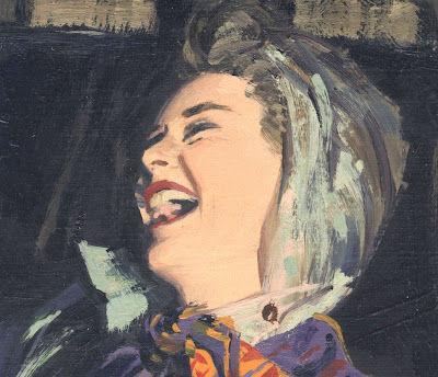

By the 1950s, plastic had been invented and clear plastic raincoats became a fashion trend. Many illustrators were drawn to the challenge of capturing light reflecting on this new, translucent material:

Austin Briggs

Al Parker

Robert Fawcett

Al Parker

Robert Fawcett
Monet brilliantly captured the essence of light on water by using bold daubs of fresh paint, rather than painstakingly blending and smoothing the colors.


Briggs brilliantly captured the essence of light on plastic using the same bold approach.


Briggs and Monet each realized that carefully blending with smooth brush strokes would have stripped the painting of its vitality without improving its accuracy. You have to be very, very good to get away with painting this loosely.
One other point about the illustrators who chose to paint translucent raincoats when it would have been far easier to paint a nice wool overcoat: Artists who produce art in exchange for food and shelter always develop tricks to be more efficient, save time, and (most of all) conceal any gaps or shortcomings in their skills. For example, artists who are not good at drawing hands tend to draw people holding their hands behind their backs. Artists who have trouble with perspective tend to draw pictures with a narrow depth of field. And of course, heavy shadows have long been a favorite technique for concealing a multitude of artistic weaknesses.
So I have special admiration for artists who, while working under a deadline, look for tough and interesting new artistic challenges. The centerpiece of the Al Parker illustration above is clearly the plastic raincoat. The same with the Austin Briggs illustration. These were not commercial choices, they were aesthetic decisions motivated by the same artistic ambition, pride and curiosity about the world that motivated Monet.
Type effects with Adobe Illustrator
"Many graphic designers, illustrators and digital artists use Illustrator on a daily basis for creating fantastic vector images, but the application’s typography tools are often overlooked – or at least, not used to their full potential." Go to tutorial page. by Digital Arts Magazine
Monday, 1 September 2008
ARTISTS IN LOVE, part 15

In 1886, Camille Claudel dictated a contract for her lover to sign. Claudel was only a young art student but her lover, the great sculptor Rodin, obediently wrote down every word:
In the future starting from this day of October 12, 1886, I will have as my Student only Mademoiselle Camille Claudel, who will be my sole protege.... I will accept no other students to avoid producing, by chance, rival talents, although I suppose that such naturally gifted artists occur very rarely.... Under no excuse will I ever go to visit Madame X again, to whom I will no longer teach sculpture. After the exhibition in May we will leave for Italy, remaining there at least six months together in indissoluble union after which Mademoiselle Camille will be my wife.Camille's contract doesn't specify what Rodin received in exchange, but his letters made it pretty darn clear:
-- A. Rodin
I only had to meet you for everything to take on unknown life, for my gray existence to flare up in a bonfire. Thank you, for its to you that I owe the entire measure of heaven that I’ve had in this life.… My dearest, down on both knees I embrace your fair body.Rodin met Camille when he was 42 and living with his long term companion, Rose Beuret. Rose was a seamstress who shared none of his friends or interests, but she took care of his daily needs and provided him with order and stability.
Camille took a job as Rodin's apprentice but critics agree she was so talented that she soon became a major influence on his art. The two worked side by side, creating beautiful and sensuous objects:


When the time was right, Camille disrobed for Rodin. Her nude form became the inspiration for some of his greatest works of art.

Rodin soon became a captive of his love for Camille. He followed her around, begging her to see him:
My savage sweetheart, Yesterday evening I scoured our usual places (for hours) without finding you. How sweet death would be!... I can’t take it any longer. I can’t go another day without seeing you.... I love you furiously. Rest assured dear Camille, that I have no liking for any other woman, that my entire soul belongs to you.For years Rodin and Camille continued their partnership commingling art and love.

Statue by Camille
Eventually, the story of Camille and Rodin spiraled to a tragic end. He began to withdraw from the intense demands of their relationship, preferring the calm companionship of his "gray existence" with Rose. Camille became despondent, making angry sculptures about abandonment.

Before long Camille sank into mental illness, screaming in the streets that Rodin was trying to kill her and steal her ideas. She was placed in an asylum where she spent the rest of her life while Rodin married the talentless Rose and became wildly successful. His lack of passion for Rose did not seem to hinder his ability to make passionate art.


The fulgurous combination of Rodin and Camille emitted some illuminating sparks for us:
Rodin was better at creating art about love, but Camille was better at loving. She followed her passion for Rodin right over a cliff, while the more cowardly Rodin accompanied her only as far as the edge, then backed away.
If one thing is certain from the long history of art, it's that you can't make art and make love at the same time (or, in the words of Robert Coane, "you can't drool and draw.") Every artist who has tried to combine the two (and which artist over 18 has not?) ends up with artistic mush. Love requires acceptance and commitment while art requires discrimination and challenge. As much as we yearn to merge art and love, it seems that the price of great art remains detachment. Poet Peter Viereck wrote,
Art, being bartender, is never drunkPerhaps the separation between art and experience is the source of the very ache that leads to art.
And magic that believes itself must die
Subscribe to:
Comments (Atom)