Wednesday, 29 July 2009
Tuesday, 28 July 2009
THE PRICE OF MINT CONDITION

The world is divided into those who seal their comic books in mylar containers and those who do not. This division is more fundamental than politics, race, religion or gender.
At last week's San Diego Comic-Con, collectors with the foresight to preserve their comics in mint condition reaped huge economic benefits. Comic books that had been hermetically sealed, unread, in climate controlled environments sold for hundreds of times the price of battered, well read comics.
Still, I'm baffled by those who moaned, "if only I had kept my comics in mint condition I could be rich now." I've never seen any comic book, no matter how perfect its condition, sell for enough to buy back those missed hours spent reading comics under a shady tree during our childhood.
In fact, as we become older and richer, and our pleasures become more complex, that youthful form of ecstasy slips further and further away. Its distance in the rear view mirror seems to increase exponentially in proportion to the value of the car we are driving. We can't take it with us, even in that Mint 10.0 copy of Detective Comics no. 27 vacuum sealed in a lucite block on the front seat next to us.
Still, you have to respect the fact that people collect comic books, like they collect other art, for all kinds of reasons. I took good care of my own comics because I respected their magic pictures and stories and wanted to visit them again and again. Today they are no longer in mint condition but they do have the additional glow that all things acquire from being seasoned by love over a long period of time.
I was particularly interested by the numerous comics business services at Comic-Con. Rating and scoring experts. Insurers. Appraisers. Economic consultants promising to fit your comic book "inside an archival-quality interior well, which is then sealed [through a combination of compression and ultrasonic vibration] within a transparent capsule" where you can no longer see the drawings.
This may make economic sense for some. For me, the best economist remains the great Ralph Waldo Emerson who said, "economy does not consist in saving the coal but in using the time while it burns."
Monday, 27 July 2009
Saturday, 25 July 2009
Working with Clipping Masks and Free Transform in Adobe Illustrator
"You’ve probably heard of a Clipping Path in Photoshop. Well, a Clipping Mask in Illustrator is pretty much the same thing (Corel Draw calls it a “Powerclip,” and in Freehand, “Paste Inside”). It’s a vector path that masks, or “clips” out part of the image. Clipping Masks provides vector artists with more flexibility when building and organizing files. For designers, they can be scary at first, but are easy to de-mystify... Here we go:
In Photoshop and InDesign, Clipping Paths are often used to isolate an irregular shape in a photo to create a “cutout”. Since irregular vector shapes can be easily made, why would you need to use a Clipping Mask in Illustrator? Most of the time, they’re used to crop a set of irregular shapes into a neat, simple shape. In this regard, it can be helpful to think of them as “cropping masks.” Except with one benefit: the cropped or excluded part of the image doesn’t really go away, it’s just hidden. Let’s have a look. Full Article (via iStockPhoto)
In Photoshop and InDesign, Clipping Paths are often used to isolate an irregular shape in a photo to create a “cutout”. Since irregular vector shapes can be easily made, why would you need to use a Clipping Mask in Illustrator? Most of the time, they’re used to crop a set of irregular shapes into a neat, simple shape. In this regard, it can be helpful to think of them as “cropping masks.” Except with one benefit: the cropped or excluded part of the image doesn’t really go away, it’s just hidden. Let’s have a look. Full Article (via iStockPhoto)
Fabulous Las Vegas Vector Design Elements
Glitz, Glamour & Gambling. Since 1959, the "Welcome to Fabulous Las Vegas" sign welcomes you to the heart of the Strip, where heart-pounding excitement, the amazing shows and non-stop gaming action await you at every turn...
No wonder Las Vegas has been called Sin City, because the seven deadly sins are all-over the place. Let us entertain you with this "Las Vegas Show" vector elements, free to download and use under the Creative Commons Attribution.
If you post the vector on your site, please make sure to include a link to www.vector-art.blogspot.com Download
 Follow Vector Art Packs On Twitter
No wonder Las Vegas has been called Sin City, because the seven deadly sins are all-over the place. Let us entertain you with this "Las Vegas Show" vector elements, free to download and use under the Creative Commons Attribution.
If you post the vector on your site, please make sure to include a link to www.vector-art.blogspot.com Download
Thursday, 23 July 2009
10 Stunning Vector Pattern Sets for Adobe Illustrator
Here we have a collection of consistent, unique and interesting seamless patterns for Adobe Illustrator users. You can use them for digital artwork decoration or brainstorming.
Below you will find image previews, artist info, download links and usage instructions. If you use some of them, don't be shy and post a link to your work in the comments section...
The resources have been released under CC Attribution-Noncommercial 3.0 License
Retro Flower Patterns
A floral pattern for Adobe Illustrator from Water Pistol.This set contains three variations of the pattern you see above. To use, expand the ZIP file, open the PDF with Adobe Ilustrator and bring up the swatches palette (Window>Swatches). Download
Vector Target Swatches

A free seamless pattern resource from Chibiki. The pack includes red, orange, blue, green, purple, yellow and gray versions of the swatch. To use, load the PDF file with Adobe Illustrator and open the swatches palette. Download
Flowered Pijamas

A cute five-color pattern from Jill Schwegel. You can use it for designing a web background, decorate a clothing design concept or just fill negative space with something fresh. To use open the PDF with Adobe Illustrator and bring up the swatches window (Window>Swatches>. Download
Cherry Background

A free vector background design resource from Julia Syrykh. You might find use of it as a web background or as an environment for your latest flash animation. Customizable with Adobe Illustrator. Download
Aloha Seamless Pattern

Another seamless pattern for Adobe Illustrator from Jill Schwegel. The swatch is constructed by hibiscus flower and pineapple shapes, available in large (300x300) and small (150x150) tiles. To use, expand the ZIP archive, open with Adobe Illustrator, and bring up the swatches palette. Download
Floral Pattern

A free EPS flower from Skeedio. You can customize the artwork with almost any popular vector graphics editor (Corel Draw, Inkscape, GIMP, Adobe Illustrator, etc.). Download
Damask Pattern

A free damask pattern for Adobe Illustrator from Grunii. To use, expand the ZIP archive and open the AI file with Adobe Illustrator. Download
Seamless Bubbles

A collection of seven seamless bubble pattern swatches for Adobe Illustrator from Chibiki. To use, load with Adobe Illustrator, draw a vector object, select it, bring up the swatches window (Swatches>Window) and apply a pattern of your choice. Download
52 Seamless Halftone Patterns

A collection of 52 seamless halftone patterns for Adobe Illustrator by Faerie Dreamer. To use, load the PDF file in Adobe Illustrator by selecting File>Open>Browse (Don't use click+drag) and bring up the swatches panel. Download
45 Degrees Stripe Patterns for Adobe Illustrator

A free pack of 28 vector pattern swatches for Adobe Illustrator Nagash. Stripes in 7 different sizes, rotated left and right; Straight line and faux-pixilated line; Black-transparent, and black-red variations; To use, load the PDF file in Adobe Illustrator and open the swatches palette (Window>Swatches). Download
 Follow Vector Art Patterns On Twitter
Below you will find image previews, artist info, download links and usage instructions. If you use some of them, don't be shy and post a link to your work in the comments section...
The resources have been released under CC Attribution-Noncommercial 3.0 License
Retro Flower Patterns
A floral pattern for Adobe Illustrator from Water Pistol.This set contains three variations of the pattern you see above. To use, expand the ZIP file, open the PDF with Adobe Ilustrator and bring up the swatches palette (Window>Swatches). Download
Vector Target Swatches
A free seamless pattern resource from Chibiki. The pack includes red, orange, blue, green, purple, yellow and gray versions of the swatch. To use, load the PDF file with Adobe Illustrator and open the swatches palette. Download
Flowered Pijamas
A cute five-color pattern from Jill Schwegel. You can use it for designing a web background, decorate a clothing design concept or just fill negative space with something fresh. To use open the PDF with Adobe Illustrator and bring up the swatches window (Window>Swatches>. Download
Cherry Background
A free vector background design resource from Julia Syrykh. You might find use of it as a web background or as an environment for your latest flash animation. Customizable with Adobe Illustrator. Download
Aloha Seamless Pattern
Another seamless pattern for Adobe Illustrator from Jill Schwegel. The swatch is constructed by hibiscus flower and pineapple shapes, available in large (300x300) and small (150x150) tiles. To use, expand the ZIP archive, open with Adobe Illustrator, and bring up the swatches palette. Download
Floral Pattern
A free EPS flower from Skeedio. You can customize the artwork with almost any popular vector graphics editor (Corel Draw, Inkscape, GIMP, Adobe Illustrator, etc.). Download
Damask Pattern
A free damask pattern for Adobe Illustrator from Grunii. To use, expand the ZIP archive and open the AI file with Adobe Illustrator. Download
Seamless Bubbles
A collection of seven seamless bubble pattern swatches for Adobe Illustrator from Chibiki. To use, load with Adobe Illustrator, draw a vector object, select it, bring up the swatches window (Swatches>Window) and apply a pattern of your choice. Download
52 Seamless Halftone Patterns
A collection of 52 seamless halftone patterns for Adobe Illustrator by Faerie Dreamer. To use, load the PDF file in Adobe Illustrator by selecting File>Open>Browse (Don't use click+drag) and bring up the swatches panel. Download
45 Degrees Stripe Patterns for Adobe Illustrator
A free pack of 28 vector pattern swatches for Adobe Illustrator Nagash. Stripes in 7 different sizes, rotated left and right; Straight line and faux-pixilated line; Black-transparent, and black-red variations; To use, load the PDF file in Adobe Illustrator and open the swatches palette (Window>Swatches). Download
Chipped & tattoed
 Turbo got chipped & tattooed today.
It was so much fun, he got to play
with his five brothers and sisters.
And I had very interesting conversations
with the other puppy owners.
Not to brag or anything...
but our puppy was the best behaved
and also the cutest ;)
. . . . . . . .
I've been guest blogging at a beautiful blog
called Habit during the month of July.
You can check it out by clicking here.
Lapidating Modern Art


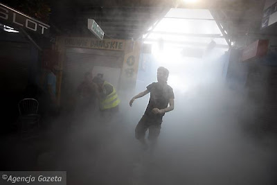
A few days ago I witnessed an excessively sad event. A huge group of merchants was thrown out (by the police) of a hall in the center of Warsaw (which they had been renting for several years), and the events turned violent and nasty, with throwing of stones and fights and tear gas and general havoc.
Although it did look like some sort of incomprehensible flash mob or other performative party, one could hardly squeeze it into the “new art” category, were it not for one significant detail: the commercial hall is to be substituted by the Museum of Modern Art. Of course, the city authorities claim the undoing of this most hideous hall is necessary for the construction of a second line of the metro, but the fact is: the temple of 90’s-style small, bad quality commerce will be replaced by the temple of contemporary art.
The obvious implication of this week’s events is: the Museum of Modern Art will arguably be the most despised building in Poland. So far, the only (extremely heated) debates about its character, name (Contemporary or Modern?), and, of course, its shape, interested only fairly elite circles. The building itself raised most controversy, with its austere, “modernist”, or, as some put it, uninspired look. But all this was nothing compared to what happened last Tuesday: the masses moved. There was naturally no talk of the museum. Yet sooner or later, the topic will appear. The Museum will be built, and the tens of thousands of people around the country who considered what happened an act of injustice will have a surprizingly clear symbolic enemy: Modern Art.
But the hundreds of people gathered at the hall entrance would not be customers anyway. Meaning, they don’t fit the profile. Not the current one, and not any potential profile of someone “we” seem to want to educate into (our) art, into (our) culture. Why? Because the social differences are so big, it is still unimaginable for the common art curator/cultural agent to think of these people as spectators, art amateurs, partners. Just as they were hardly a partner for negotiating a new commercial deal (they rejected several offers and refused to participate in further negotiations). We will hear: They are outside of the reach of... of us, the cultural people, the elites, the-educated-ones. They are a lost case.
This is obviously the moment when the conflict becomes helpless. Each party is convinced that the others are barbarians, their entire world is wrong, corrupt, and unworthy of any contact.
Do these people need us to defend them? I believe this is not a question of need. It is a question of true access to culture. Of initiatives, or rather, structures, which would allow for a potential integration of all citizens.
The Museum of Modern Art has already had many great exhibitions. But these initiatives are clearly focused on a prestigious audience, they are intellectually sophisticated, but beyond that, they don’t seem to reach out to a “larger” audience. This reaching out has been happening in many museums around the world (take the Brooklyn Museum, with their great program of interactive activities where once a month visitors can have a totally different experience of art, which includes, for instance, making their own art prints and parties with known DJs).
In Warsaw, we have a truly outstanding exhibition relating to the great Alina Szapocznikow, an artist whose work is largely unknown outside of Poland, yet here is already considered as a crucial reference for anyone interested in modern art (the exhibition ends Sunday). Her works combine eroticism with power, femininity with a great understanding of structure and drama. Possibly the most impressive among the works presented at the show is the huge female belly sculpted in marble (actually it's a double-belly), which impresses, attracts, scares, and ultimately leaves us at a (as always unbearable) distance. What is made to counteract this distance in terms of programming? Some lectures, discussions, guided tours, and a new documentary film. All this is great for me or you. Interesting indeed.
But what about the reaching out? The search for new, active audiences?
Well, many of the women present during the events at the commercial hall were convinced to join in the creative thinking about stone – they reached out, grabbed the pavement stones, and threw them at the police. I claim they did it not only because they were “part of the mob”, but also, because they were hardly ever offered any serious alternatives.
Isn’t it time we thought about those others as true potential consumers of culture, who can be sought just as we seek the already accustomed artsy amateurs?
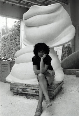
A friend of mine suggested that the 2000 salesmen thrown out on Tuesday be hired at the Museum Store.
Beyond this ironic (and hilarious) take lies the feeling that something is going terribly wrong in the way we are approaching the idea of social change.
I have been often showcasing projects with social agendas. They were more out-going, accessible, they were social sculptures or other initiatives which claimed a different approach to the audience-connection.
But at such instances, I wonder: can't social sculpture strive for effectiveness? Isn't it terribly passé to hide behind our we-are-only-poor-artists shields?
PS. The Museum of Modern Art does attempt to create a social space of dialogue, as in the initiative of a Park of Sculpture in a poor part of Warsaw. One can see the idea. Yet paradoxically even an artist like Rirkrit Tiravanija seems to have transformed of his relational aesthetics here into a... well... esoteric sculpture.
Sunday, 19 July 2009
Saturday, 18 July 2009
DANGER IN THE PATH
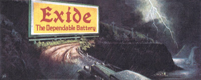
A mediocre painter who wants to portray danger on the road ahead is likely to spell out the danger, perhaps even highlighting it with some corny lightning bolt.
But more talented artists achieve far more powerful results using a diverse array of imaginative solutions to the same problem:
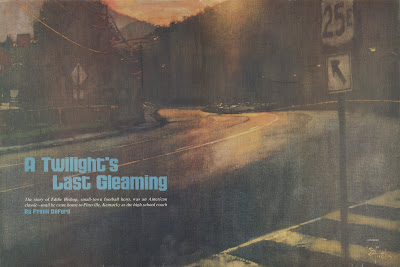
In the following illustration, all that the brilliant Bernie Fuchs requires to create a sense of melancholy is a dangerous bend in the road and forlorn colors. This is the site where a football hero committed suicide by stepping in front of an onrushing truck. Fuchs' depiction of the merciless road is subtler than painting a body lying in the road or an ambulance speeding away, but it is far more effective and universal.
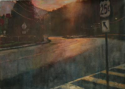
Here is how the illustration looked when published as a double page spread in Sports Illustrated (teamwork by Fuchs and famed art director Richard Gangel).
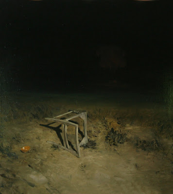
Next, rather than spotlight the danger (or illuminate it with a lightning bolt), the ingenious Phil Hale understands that it is far more frightening to speculate about what waits in the darkness, just beyond the reach of the beam of light:
Below, the talented Greg Manchess takes a different approach: look at how effectively he uses fog and shadow and eerie light to cast a sinister aura on an otherwise normal road.
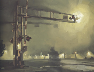
It's not that difficult to paint realistically; it must have been far harder for Manchess to decide when to deviate from the safety of realism in order to disorient the viewer. He had to be selective in order to make us feel that the scene is taking place in an otherwise normal world where something is coming unglued. That is the point where an artist has to rely upon judgment and imagination, leaving behind technical manuals on perspective and lighting.
Each of these artists recognized the inadequacy of a literal approach for conveying menace. Each of them used ambiguity and restraint to draw the viewer's imagination into the creative process. Each of them had the technical skill to master a variety of elements to craft just the result they wanted.
Friday, 17 July 2009
"Waterproof Your Music" Poster Ad Campaign by LOWE Egypt
Two Of the posters from an adcampaign for H2O Audio waterproof cases and Virgin Megastores. The concepts feature caricatures of Snoop Dogg as a surfer and Scuba Diver Madonna...
Advertising Agency: LOWE Egypt, Cairo, Egypt
Advertising Agency: LOWE Egypt, Cairo, Egypt
Creative Director: Hisham Kharma
Art Director: Montasser Khalil, Hisham Kharma
Labels:
Advertising,
Art,
Comics,
Fashion-Illustration,
Gallery,
Street-Art
Export AI to XAML. Adobe Illustrator CS4 Plugin
A freely available plug-in that enables Adobe Illustrator to export WPF and Silverlight compatible XAML Created by Michael Swanson...
"If you use Adobe Illustrator and would like to get your artwork into a WPF or Silverlight application using XAML, you've come to the right place. I've been updating my freely available plug-in since 2005, and there are now versions that work with both the PC and the Mac." More Info & Download Links
"If you use Adobe Illustrator and would like to get your artwork into a WPF or Silverlight application using XAML, you've come to the right place. I've been updating my freely available plug-in since 2005, and there are now versions that work with both the PC and the Mac." More Info & Download Links
What is Typography?
A lesson by from the Vancouver film school. www.multimedia.edu
Typography is the art and technique of arranging type, type design, and modifying type glyphs. Type glyphs are created and modified using a variety of illustration techniques.
The arrangement of type involves the selection of typefaces, point size, line length, leading (line spacing), adjusting the spaces between groups of letters (tracking) and adjusting the space between pairs of letters (kerning). Read more
Wednesday, 15 July 2009
Abstract Art Brushes for Adobe Illustrator
A collection of five abstract brushes for Adobe Illustrator by HumanNature84. Perfect for drawing abstract graphics. If you experiment with different stroke colors, size and layer transparency you can get all sorts of visual effects...
To use, load the PDF file in Adobe Illustrator (use the "File>Open" method, not "Click n' Drag") and bring up the brushes palette from the Windows menu (Windows>Brushes) of press F5.Download
This work is licensed under a Creative Commons Attribution-Noncommercial-No Derivative Works 3.0 License.

To use, load the PDF file in Adobe Illustrator (use the "File>Open" method, not "Click n' Drag") and bring up the brushes palette from the Windows menu (Windows>Brushes) of press F5.Download
This work is licensed under a Creative Commons Attribution-Noncommercial-No Derivative Works 3.0 License.
Tiny Book of Art
Subscribe to:
Posts (Atom)


