Sunday, 30 March 2008

THE AGONY OF TANTALUS


If Beethoven had gone deaf all at once, he might not have developed into Beethoven. He might simply have adapted to the loss, as many others have.

But Beethoven's hearing gradually slipped away over 25 years, coming and going unpredictably. It faded tantalizingly in and out of reach as he was trying to realize his artistic visions. This slow torture caused him daily anguish. He could never be certain whether he would be capable of conducting a concert. Worse, he never knew which precious sound would be his last.

Beethoven didn't dare tell the world about his disability but he wrote of his despair in a private testament, agonizing that when other people heard a sound,

I heard nothing... such incidents brought me to the verge of despair.... I would have put an end to my life -- only... it seemed impossible to leave the world until I had produced all that I felt called upon me to produce, and so I endured this wretched existence.
Historians such as Robert Greenberg and Maynard Solomon believe Beethoven was able to reach new heights because of the spiritual and physical isolation he suffered during his prolonged struggle with his hearing. Perhaps his seclusion from the sounds of the world freed him from convention and allowed him to create new musical forms.

Beethoven's tragic burden is an example of what Peter Viereck calls "the weight that tortures diamonds out of coal."

Which brings us to the artist Degas.

Degas started out as a meticulous craftsman, carefully trained in traditional drawing and painting methods.
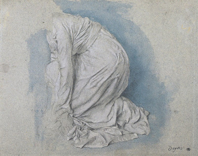
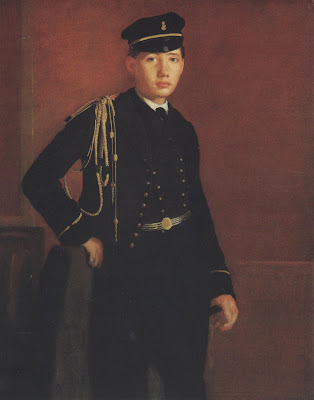


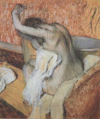
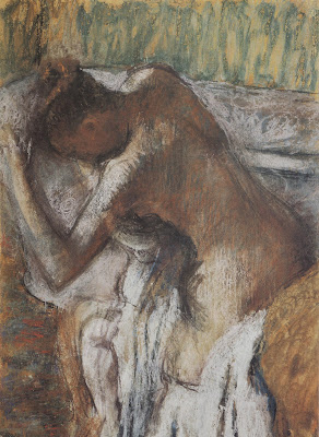
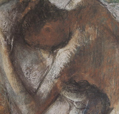
However, he suffered from increasingly poor vision his entire adult life. As John Updike reported, "by his forties he was virtually blind in his right eye; and by the 1890s he periodically donned corrective spectacles blacked out except for a small slit in the left lens."

Over the years as his eyesight dimmed, Degas developed a looser, more energetic style:
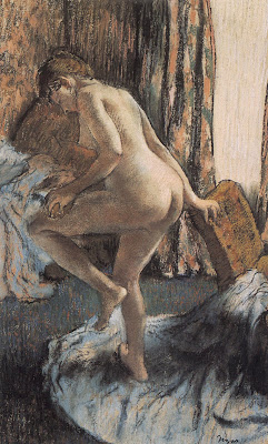


He lived in dread of his oncoming blindness, but as the artist David Levine noted,

It didn’t stop Degas.... He went on to change his way of seeing. He just moved into a rhythm of color and bigger generalities in the way he saw things like hands or faces.
Just as with Beethoven, some of Degas' most beautiful work resulted from his enormous talent twisting and turning to escape being smothered by the artist's physical disability:
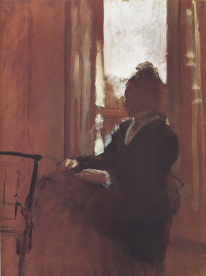
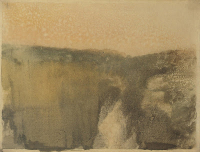


Green Landscape
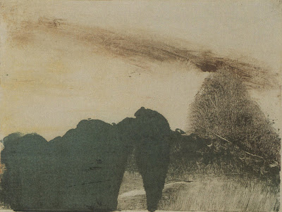

Wooded Landscape

Tantalus was the character from Greek mythology who stole ambrosia from Zeus' table and brought it back to his people, revealing the secrets of the gods.

His punishment was terrible: he spent eternity in a pool of water beneath a bountiful fruit tree. But whenever he reached for the fruit, the branches raised above his grasp. Whenever he bent down to try to drink, the water receded. (We get the word "tantalize" from poor Tantalus.) And while all that food and drink hovered beyond his reach, the gods placed a threatening boulder over his head.

The price of ambrosia comes high.


Saturday, 29 March 2008

Floating Trees

Vector illustration by LoneWolf


US: Yunique Solutions adds new PLM tools

"Yunique_Solutions Inc, the developer of product_lifecycle_management solutions for the fashion industry, has added new image management capabilities to its flagship PLMOn solution.

The tools include an advanced digital storyboard, image sharing, and Adobe integration, and are aimed at addressing the needs of fashion designers, merchandisers, and product developers.

The image cataloging tools enable users to place materials, trims, sketches, technical drawings and pictures into a digital storyboard for use in line planning, line selection, and visual collaboration with suppliers and customers.

Once design and merchandising concepts are added, the digital storyboard serves as a natural starting point for product developers to launch new raw materials and product/style development from this visual workspace.

The browser-based software is said to be fully compatible with both PC and Mac operating systems and allows users to work directly with popular design file formats, including industry-specific CAD systems.

Yunique has also developed Adobe Illustrator tool boxes that provide fashion-specific brushes, symbols and other design tools for PLMOn users.

Product information can be shared and modified by in-house teams, across the supply chain or with customers."

Skateboarding Shapes For Photoshp

Skateboarding custom (vector) shapes for Photoshop by lukeroberts To download, click here.

Thursday, 27 March 2008

Vector National Flags Collection

In February I posted a detailed scalable political vector map with most countries, well today I found another large vector flag collection for Adobe Illustrator. The pack contains 274 national flags, all vector, THANKS to raknoob. The archive file is a self extraction application (.exe file) download it from here. I'm not sure that you can run an exe file on a macintosh, so for all mac users I made a zip archive available for download here. Enjoy !

Wednesday, 26 March 2008

THE SIMPLER SIDE OF WILLY POGANY

Many people say that the illustrator Willy Pogany (1882-1955) reached the pinnacle of his career with a series of lavish, ornate books including The Rime of the Ancient Mariner (1910), Tannhauser (1911), Parsifal (1912) and Lohengrin (1913). These books feature spectacular gilt designs on sumptuous leather bindings, elaborate borders on each page, and illuminated initials with hand calligraphed text.


Personally, I find them exhausting.

I don't think Pogany started getting interesting as an artist until he shed all the regal trappings and learned to simplify.


Left alone with just a line and a blank page, Pogany began to produce work of enduring value. Each line becomes more important when you don't have fancy textured paper and intricate borders to rescue (or obscure) the quality of your work.


Here are a few scans of Pogany's original drawings so you can see his line up close:


Even his small, "simple" drawings weren't that simple.


Surrounding a picture with fancy borders can enhance its appearance, but only to a limited extent. Ultimately, the picture pays a heavy price for that boost; it is harder for a picture to achieve greatness when encumbered with ornamentation. One of the most important things for an artist is knowing when to stop.

iPod GEL progress bar Illustrator Tutorial


thanks to www.tutvid.com

Tuesday, 25 March 2008

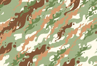
Vector Camouflage Pattern

This is a pattern tutorial for Adobe Illustrator I came across this morning, browsing computerarts.co.uk
"Have you ever needed to create camouflage patterns in Illustrator, but not known the best way to go about it? Derek Lea demonstrates his own time-saving method" Full tutorial and files

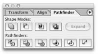
Pathfinders and Shape Modes in Adobe Illustrator

Pathfinders and shape modes in Adobe Illustrator are an important feature. If once you start to feel comfortable with them you’ll find them pretty handy for drawing all kinds of complex objects. Before you start drawing the shape of your object you should first analyze it. Look for geometric shapes within the object’s shape. Which shapes can be used to create your final object? Look for pkaces where you can use the ellipse or the rectangle tool. Most pathfinders delete objects, so have in mind to make additional duplicates. I found a great link (click here) with video explanation of the different pathfinders.I'll post more stuff about pathfinders and shapes pretty soon.

Dear Son


Victoria, London


Draw Freely : Inkscape New Release

24th March
The Inkscape community today is announcing the release of the newest version of its open source vector graphics editor. Inkscape 0.46 is a major update that introduces native PDF support. The implementation of PDF support in Inkscape provides an easy, open source solution to editing PDF documents.

Tons of new features and performance improvements are included in this release. Dialogs now have the ability to be docked to the editing window. Gradients can be edited completely on-canvas. The new Paint Bucket Tool fills bounded areas with color. A new 3D Box tool helps create perspective-correct drawings. A new Tweak tool provides an intuitive method for editing paths and painting objects. The new Live Path Effects feature can create "brushes" and various organic effects on paths. Improvements to color management include support for color spaces other than sRGB. Most SVG filters are now implemented, and a new powerful UI is provided for editing filter stacks. Check it out www.inkscape.org

Monday, 24 March 2008

Adobe Illustrator Keyboard Shortcuts That Will Help You Improve Your Pen Tool Skills pt.1

I decided to post a brief keyboard shortcut list for Adobe Illustrator for more efficient work with the pen tool.
MAC OS / Windows

Command / Ctrl = will temporary allow you to access the last selection tool you've used

Command+Space / Ctrl+Space = again a temporary access to the zoom in tool.

Option+Command+Space / Alt+Ctrl+Space = zoom out tool.

Shift / Shift = A really helpful shortcut - constrains proportions, angles, movement. It works for almost all actions in Illustrator

Spacebar = Gives you temporary access to the hand tool.

Note: The benefit of using these keyboard shortcuts is that you don't need to always activate and deactivate your line (path) for similar manipulations.

Sunday, 23 March 2008

Loosydings Expert Shape Typeface

Here is an usable free shape true type face by protofonts. If you use this typeface in Illustrator and outline the characters, you may come across many interesting symbols. Download


Saturday, 22 March 2008

Photo Tracing in Adobe Illustrator

Check this detailed tutorial on how to draw and trace people from a photo. Learn how to create realistic illustration with just simple gradient fill found in www.ndesign-studio.com

Blood Cells Brush for Adobe Photoshop

This set contains 25 different blood cell shapes by ardcor. As you can see in the preview below, the quality of the brushes is high and you can get a pretty realistic effect without a lot of effort. Download

WILLIAM OBERHARDT


William Oberhardt (1882 -1958) was like a 20th century version of Hans Holbein the Younger. Just like Holbein, Oberhardt had an astonishing gift for rendering the human head. "Heads are my preoccupation," he said. "To me the world is full of heads." Both Holbein and Oberhardt were summoned to draw the most famous people of their day. Holbein drew portraits for the court of Henry VIII while Oberhardt drew portraits for Time magazine.


Cover of the first issue of Time magazine, by Oberhardt


Portrait by Holbein

Both artists could paint, but both found their highest expression in the medium of charcoal drawing, which enabled them to display great freedom and sensitivity.


Oberhardt was a very traditional, almost old fashioned artist. He was appalled at his fellow illustrators who used photographs, emphasizing that an artist's job was not to "copy form" but to "strive for interpretation of personality through form."


He advised young artists:

Avoid haste, and don't take pride in hectic activity...Technique evolves gradually. It is the blossoming forth of years of intelligent study, not surface imitation of accepted mannerisms or formulas. Do not waste time on cleverness which might develop into mere facility.
Despite his traditional approach, you can find great, almost abstract designs in Oberhardt's portraits. Once he gets beyond the subtle nuances of the face, he allows himself to go wild with bold surrounding marks that play an important role completing the design:


In discussing "the distribution of blacks in the background," Oberhardt the traditionalist sounded surprisingly modern: "I follow only my feeling of harmony."


Friday, 21 March 2008

How 2 Design an event logo ?

Events need branding as much as anything else. Derek Lea reveals the creative process and technical considerations involved in designing an appropriate and versatile event logo.Effective logo design requires careful consideration of a variety of things. The creative process must include considered technical execution, as well as focus on creating a stunning, effective, and simple visual metaphor. Generally, the process begins with a brief from your client. Even the most basic brief must communicate the core, intrinsic values of the brand. It is with these values in mind that you can begin the process of designing an appropriate visual metaphor. Read full tutorial and download files.

computerarts.co.uk

45 Degrees Stripe Patterns for Adobe Illustrator

A free pack of 28 vector pattern swatches for Adobe Illustrator Nagash.

• Stripes in 7 different sizes, rotated left and right
• Straight line and faux-pixelated line
• Black-transparent, and black-red variations

Illustrator comes with both vertical and horizontal line patterns, but not diagonal lines. it's hard to get them correctly tiled, but I got it tight - when you resize it, sometimes you get messy corners, but there's nothing one can do about it...


Use the black-transparent versions to get a single color stripe, and the black-red if you need two colors. To change the stripe color, simply drag the pattern to your canvas, paint it, and then drag to the swatches pallete again.

To use, load the PDF file in Adobe Illustrator and open the swatches palette (Window>Swatches). Download

Thursday, 20 March 2008

25 Grunge Swatches for Adobe Illustrator

A collection of 25 grunge swatches for Adobe Illustrator from createsk8.com. They are all in different colors, you could use them as textures or for designing a grungy background element...

To use the resource first, you need to expand the .zip file, load the AI file with Adobe Illustrator, open the swatches pane (Window>Swatches) and apply them to your fill color. Download

Wednesday, 19 March 2008

"MADE FOR THE MAKER'S OWN DELIGHT"

For fifty years, cartoonist Don Trachte made an excellent living doing uninspired, simple minded drawings.


Nothing about these drawings hinted that behind closed doors, Trachte was so talented he could paint a major Rockwell oil painting well enough to fool all the experts:


Similarly, the cartoonist James Swinnerton had a long, successful career making mediocre drawings that revealed no particular artistic ability:


Yet, in his spare time Swinnerton painted powerful, sensitive landscapes:


Rose O'Neill was another artist who made a small fortune with bland, inferior drawings. The public just loved her cute little imps, called Kewpies:


Nobody guessed that behind the scenes, O'Neil drew intense, erotic drawings and wrote steamy poetry. Her real drawings look like the work of Brad Holland, who came along 50 years later.


When a reporter asked O'Neill about the striking contrast between her professional work and her personal drawings, O'Neill refused to comment, saying "these things were made for the maker's own delight."


I'm not suggesting that every one of these private pictures is a work of genius. However, it is interesting to me that so many artists could not find a market for quality art, and survived only after they dumbed down their work.


I would never have guessed from their public work that these artists were capable of creating such pictures. I think their best work, the work they did for their "own delight," deserves some exposure.